What if food tracking was less about numbers and more about mindful eating?
Many people struggle with traditional food tracking methods, often finding them stressful, restrictive, and ultimately unsustainable. The focus on calorie and macro counting can lead to an unhealthy relationship with food, fostering feelings of guilt and anxiety rather than promoting positive behavior change.
Process
After defining the target problem, we conducted user research: landscape analysis and two types of interviews (user interviews and word association) to understand user needs and pain points. The insights drove the ideation phase, which involved developing a user persona, creating wireframes, and establishing a design system. Next, we designed high-fidelity flows, conducted user testing, and refined the design before creating an interactive prototype.
Our Solution
HealthSum addresses this problem by shifting the focus from strict calorie counting to a more mindful approach to nutrition. This app simplifies food logging, making it enjoyable and accessible for all, empowering users to track intake without guilt or pressure, and fosters long-term healthy habits.
My role
I collaborated with two others on the project, where I focused on designing the early wireframes, creating the design system, leading all user testing sessions, and owning the "Add a Meal" flow from high-fidelity designs through to the final interactive prototype.
To understand the existing landscape, we began our research with a competitive analysis.
Our competitive analysis explored five apps, both within and outside the food tracking landscape. We examined LifeSum and My Fitness Pal for their food tracking features, Plant Nanny and Finch for their gamified habit-building approaches, and Duolingo for its engaging user experience.
- Gamified tracking with rewards and streaks
- Cute characters and animations
- Progress visualization, daily goals, and personalized recommendations
- Risk of feature overload, which we wanted to avoid
The playful and engaging designs of Plant Nanny, Finch, and Duolingo served as key inspiration for creating the fun and approachable experience we envisioned for Health Sum.
User needs and motivations were explored through one-on-one interviews and word association exercises.
We interviewed six individuals, ages 20 - 60, to understand their current eating habits, attitudes towards healthy eating, and perceptions of traditional calorie tracking. Open-ended interviews provided deeper insights into individual experiences, while word association exercises were specifically included to reveal emotional ties to food, food counting, and calorie counting. Key findings include:
Current Eating Habits:
- Varied approaches to eating, from mindful macronutrient tracking (especially during training) to simply aiming for regular meals
- Some participants try to eat healthy without strict restrictions
- Convenience often drives food choices, especially when busy
Perceptions of Healthy Eating:
- Generally defined as a balanced diet of protein, vegetables, fruits, and carbohydrates
- Emphasis on minimizing processed foods and sometimes prioritizing specific nutrients
- Varying perspectives on "healthy," from natural ingredients to whole foods
Emotional Associations with Calorie/Diet Tracking:
- Mainly a negative sentiment towards traditional calorie counting due to perceived restriction
- Mixed associations with "diet" and "calories," ranging from positive to negative
- Some acknowledge potential benefits of tracking for specific needs (e.g., athletes)
Based on our research, we developed a persona to represent our target user.
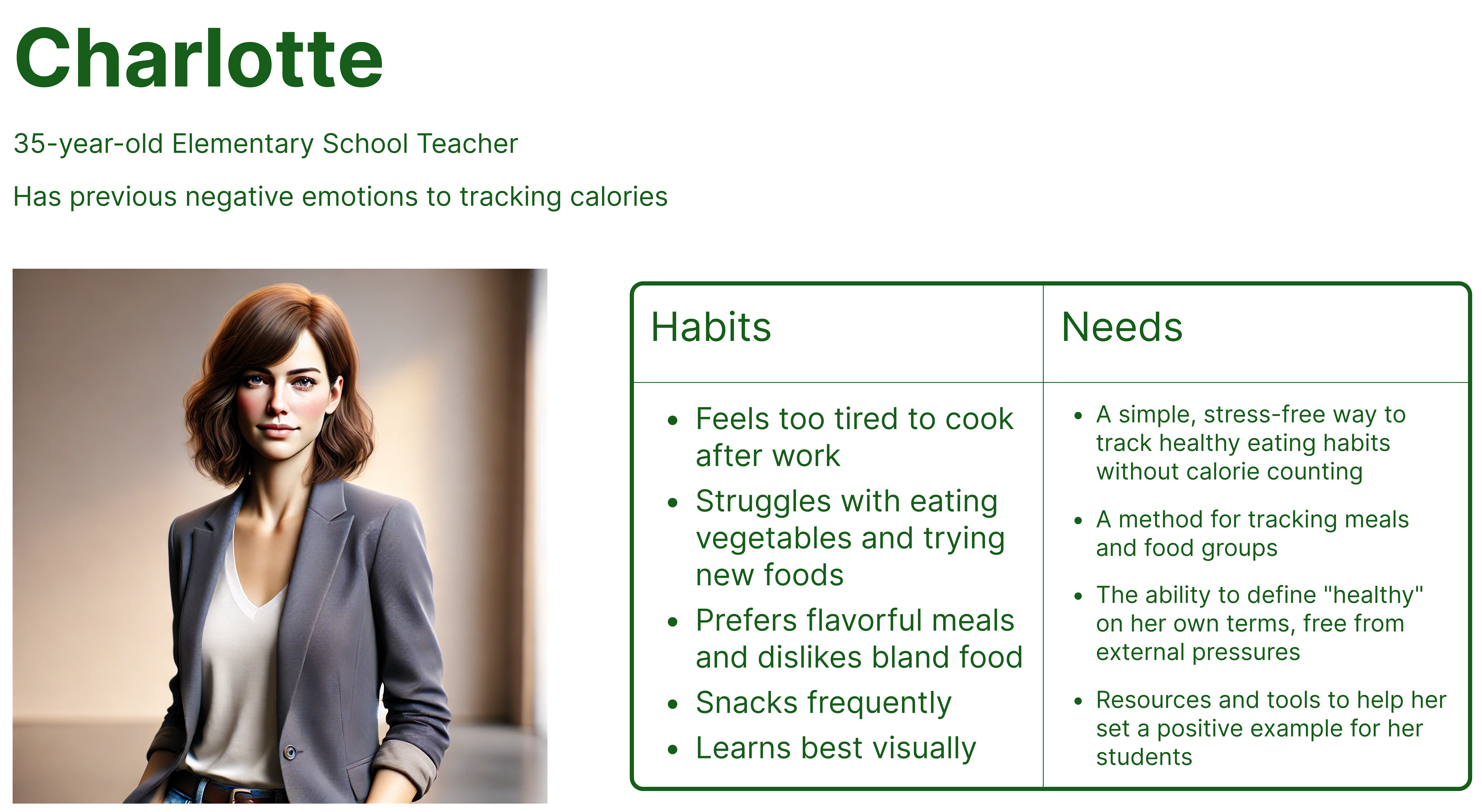
From our research and synthesis, we shaped Charlotte to represent the many users like her—people who want to eat healthier but feel overwhelmed by traditional tracking methods.
Charlotte became our guiding light throughout the design process. Every feature we included was crafted to be approachable, playful, and affirming—so users like her could feel supported rather than judged.
The next step was to translate our ideas into a working design.
Site Map
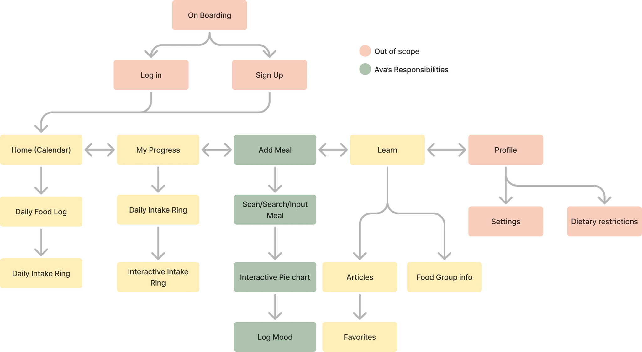
When we started ideating and sketching flows, we felt a bit lost with so many ideas and constraints—only three people and six weeks to build the entire prototype. Creating a site map early on became our turning point, helping us define scope, prioritize features, and visualize the full user journey. It also made collaboration much smoother as we could clearly delegate flows to each teammate.
I ended up taking ownership of the Add a Meal flow, while others worked on onboarding and insights. That structure kept us aligned and efficient through the rest of the project.
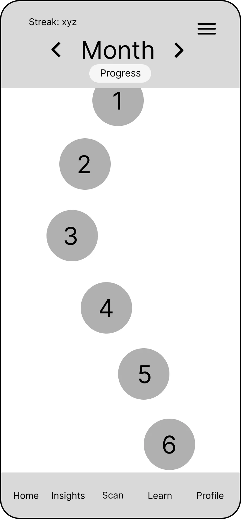
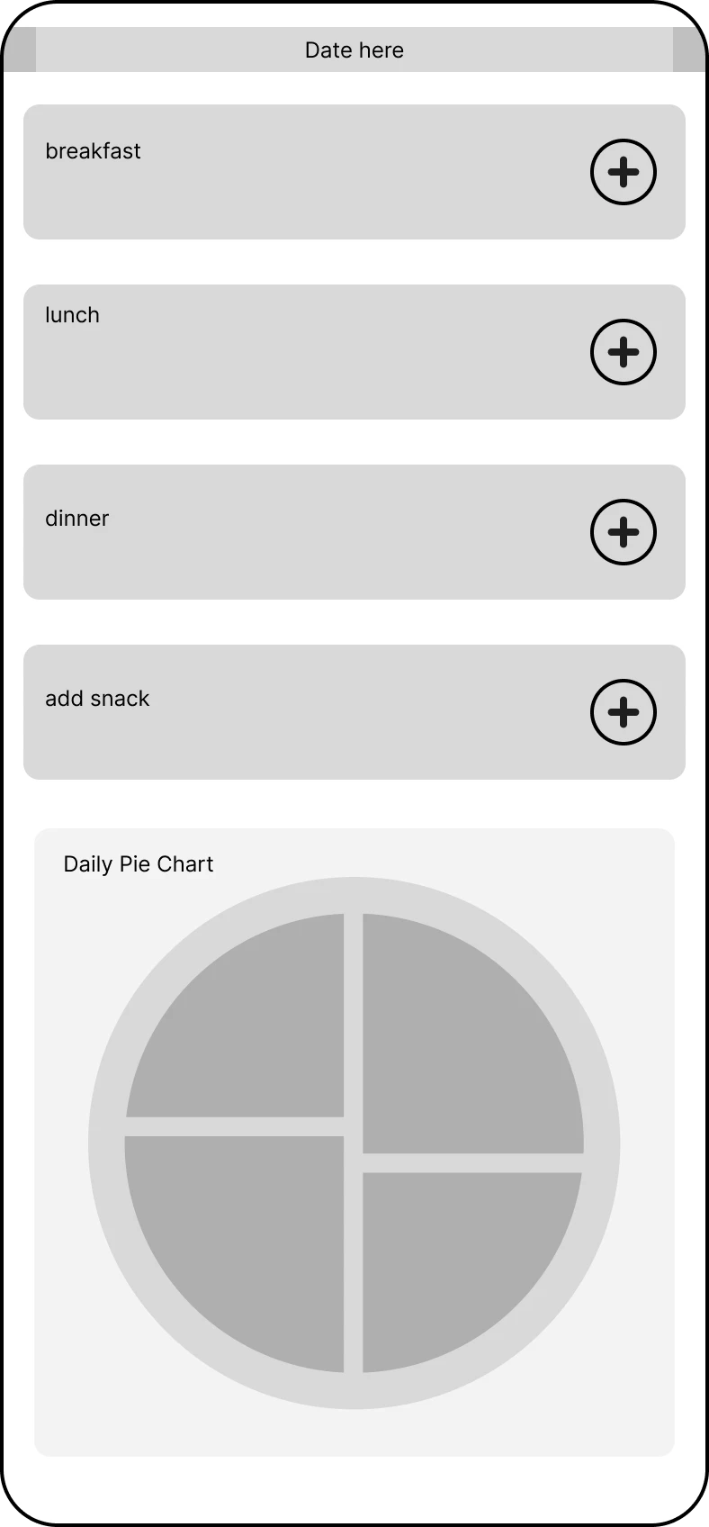
Low-Fidelity Wireframes
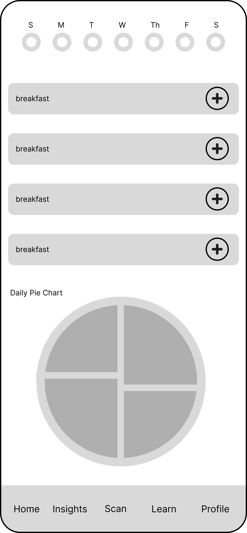
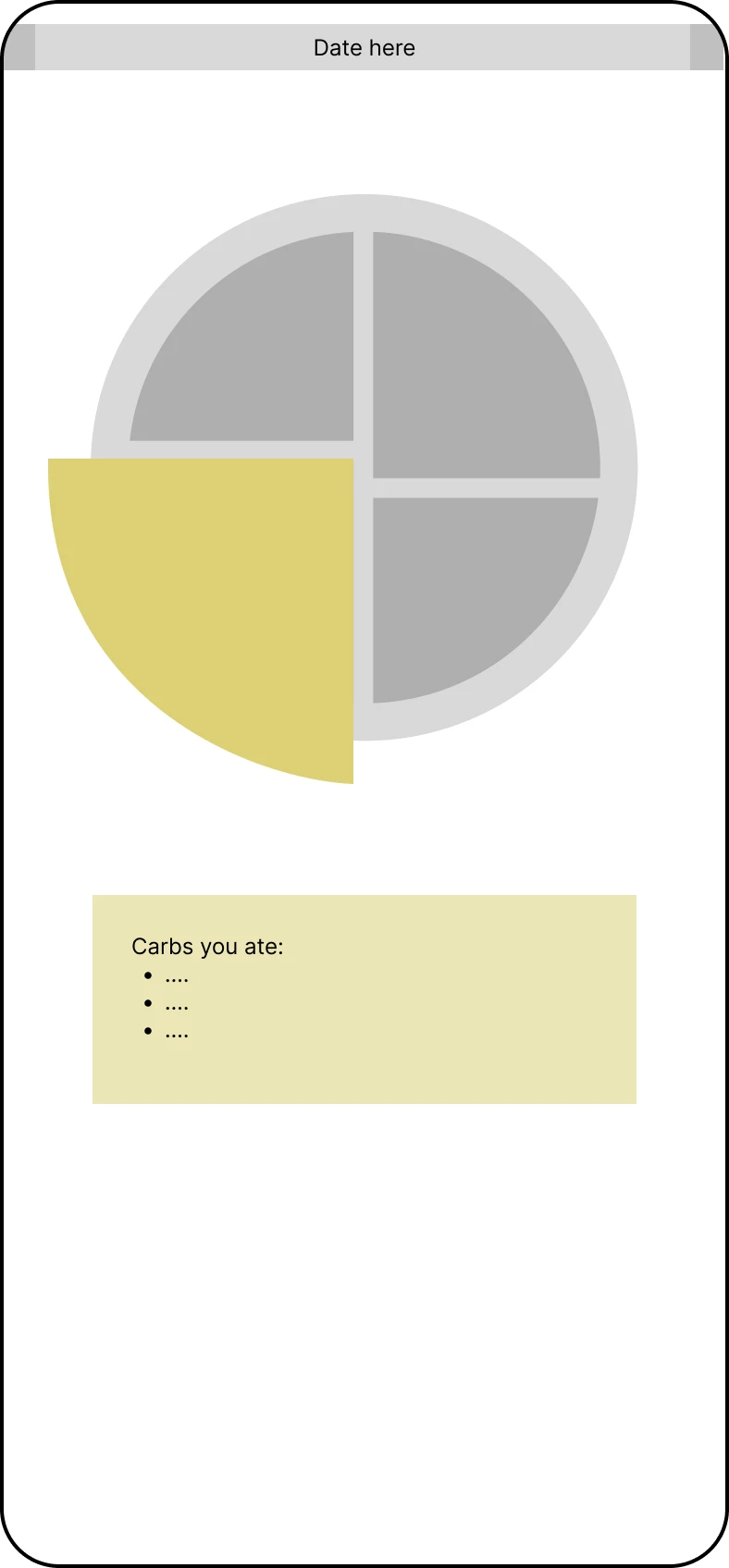
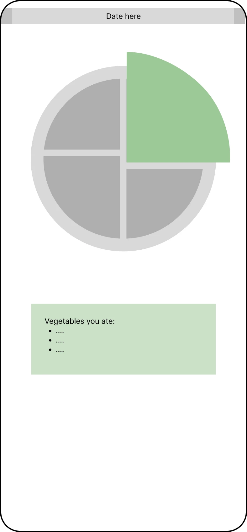
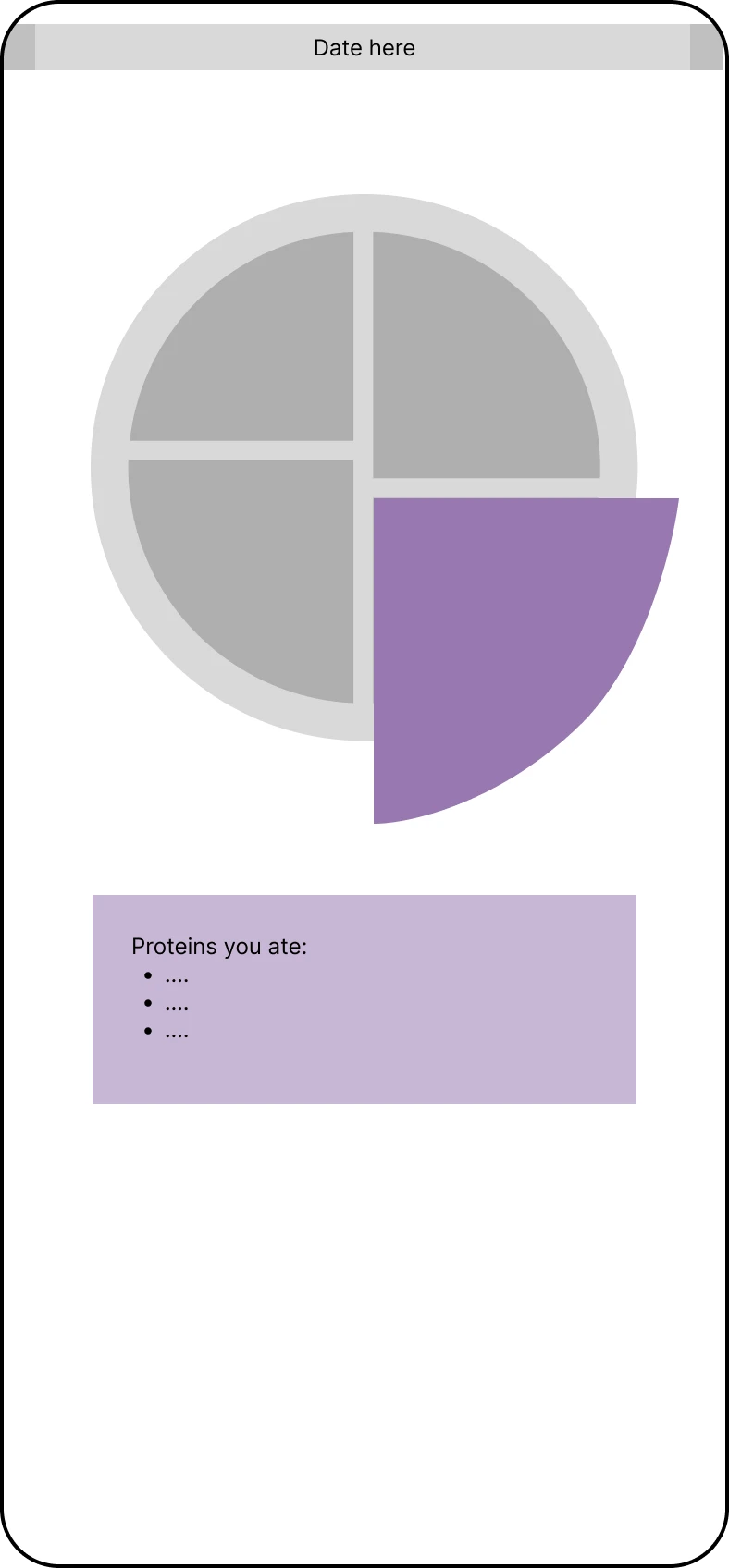
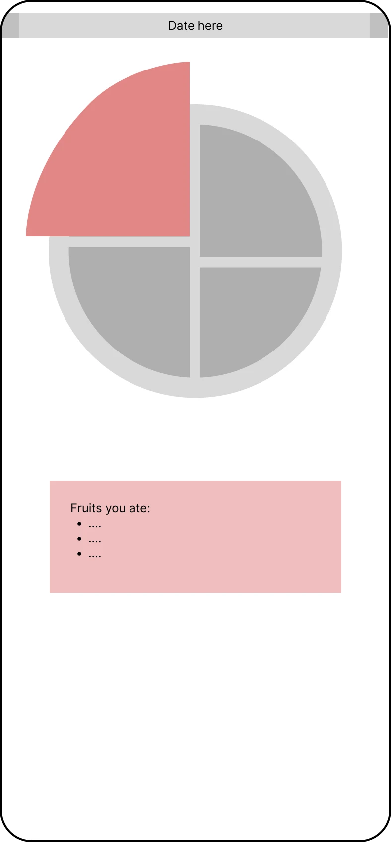
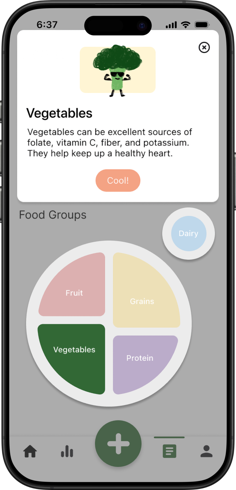
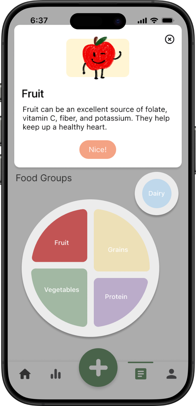
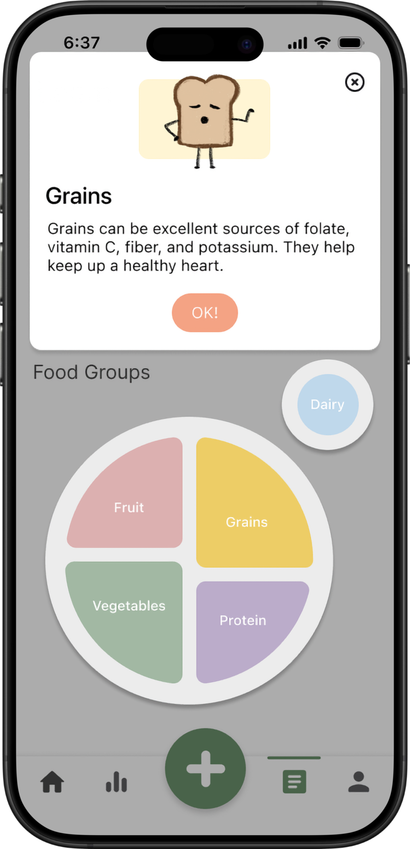
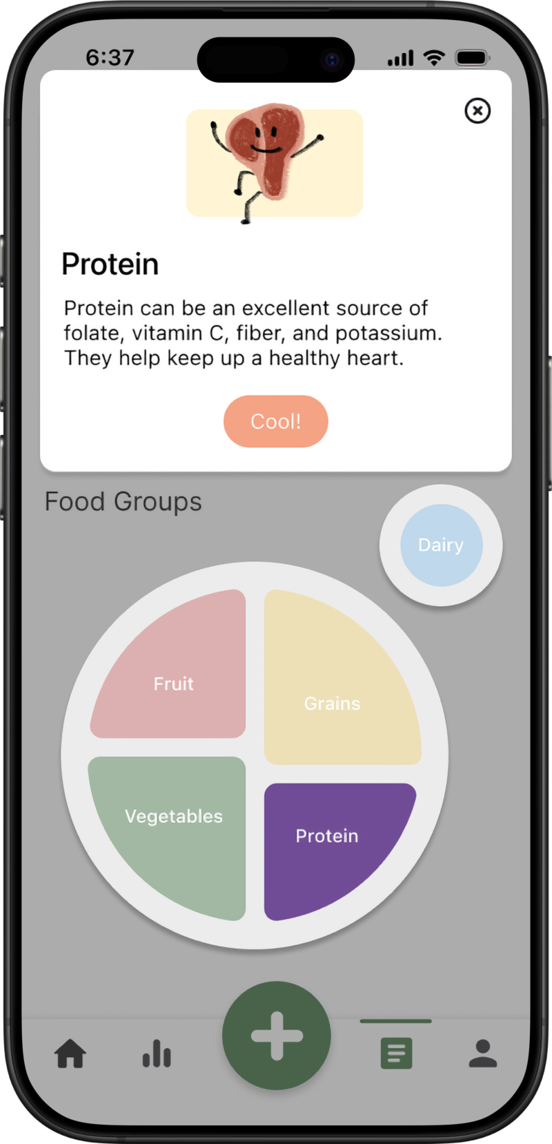
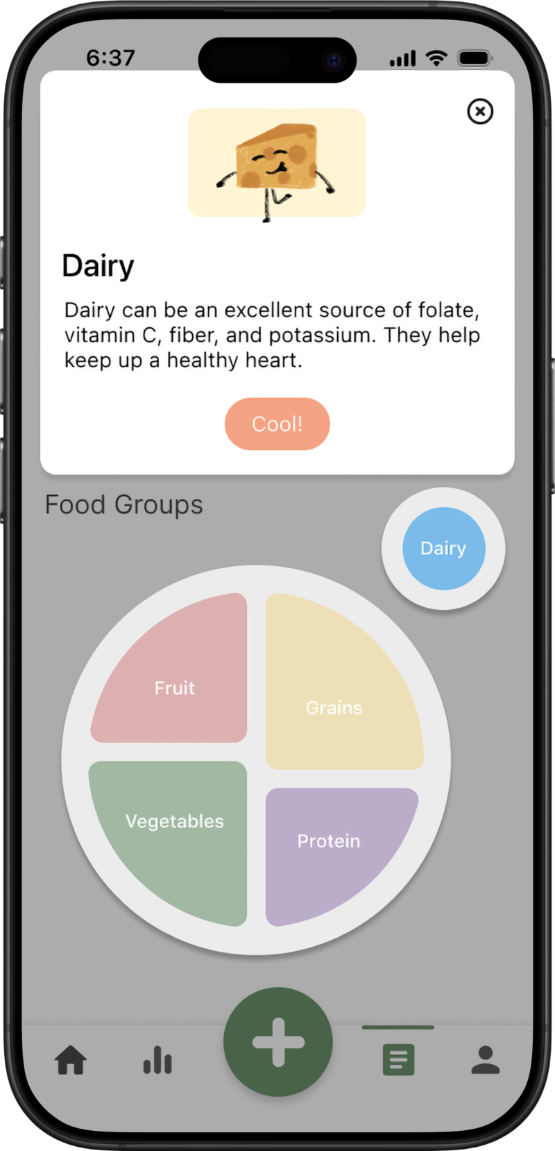
During wireframing, we focused on user flows and screen structure, exploring interactive elements like a pie chart for visualizing food group percentages, allowing users to quickly grasp their nutritional balance. One area we were actively developing was the 'Insights' page for visualizing daily logged meals, tracking progress towards food group goals (water, fruit, vegetables, etc.), and providing positive reinforcement. A key design question at this stage was whether to combine the meal log and interactive pie chart on the 'Insights' page or separate them for improved visual clarity.
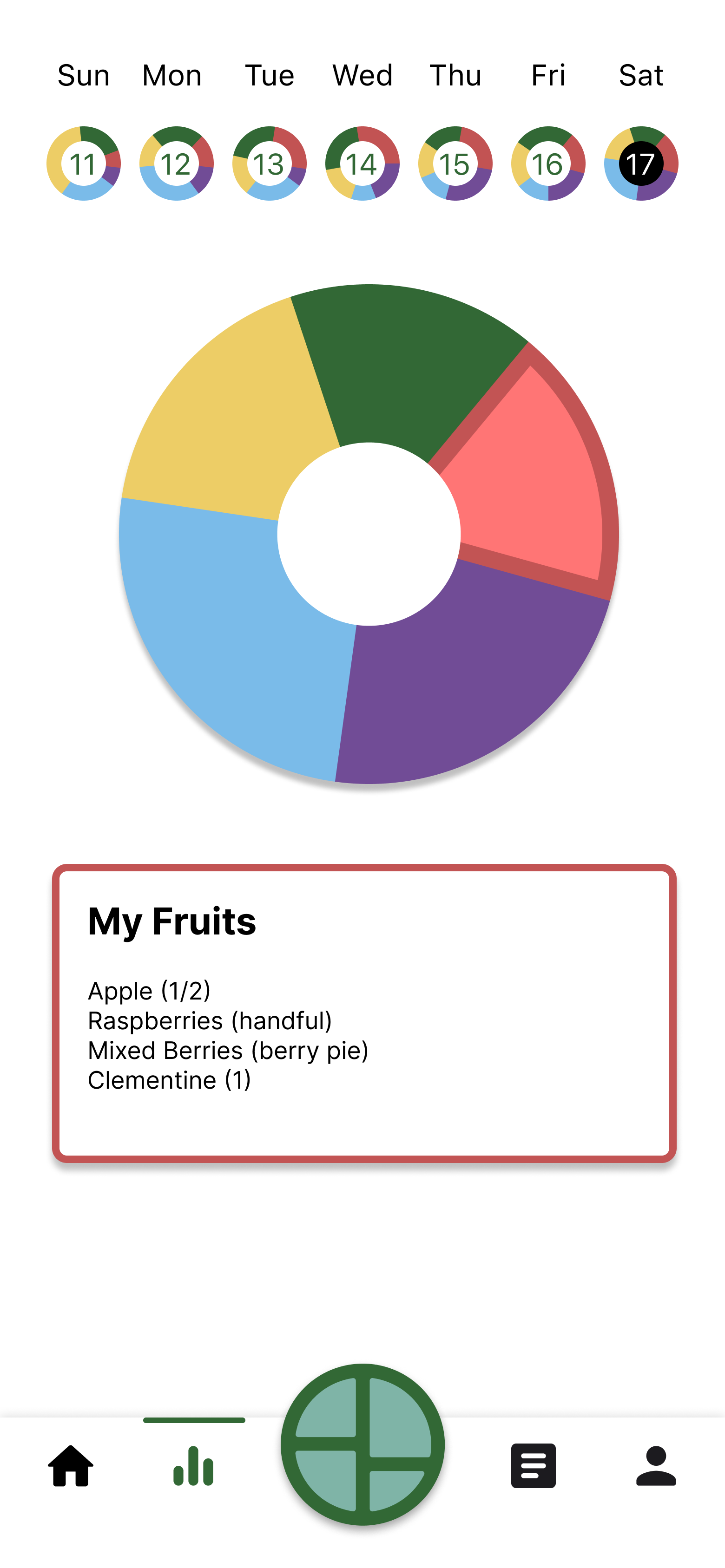
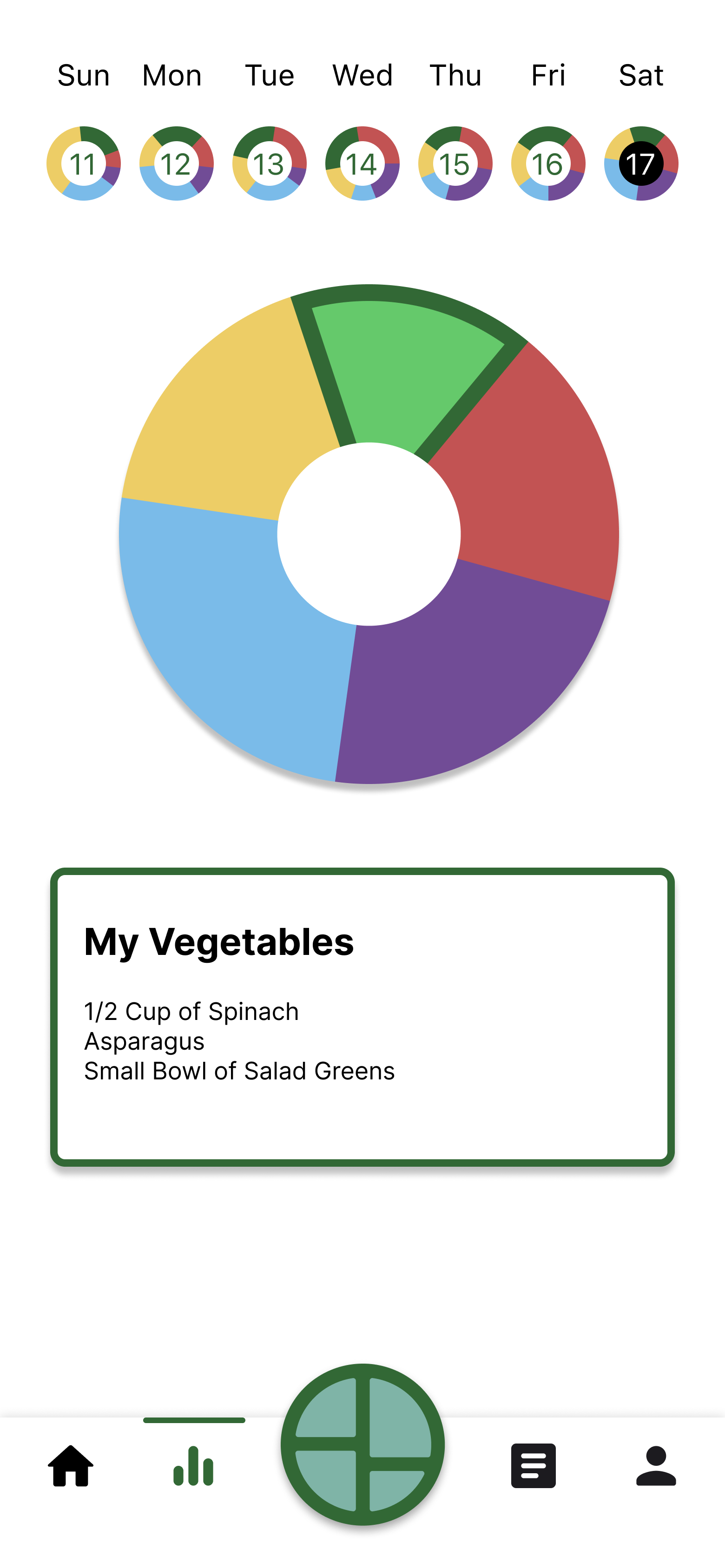
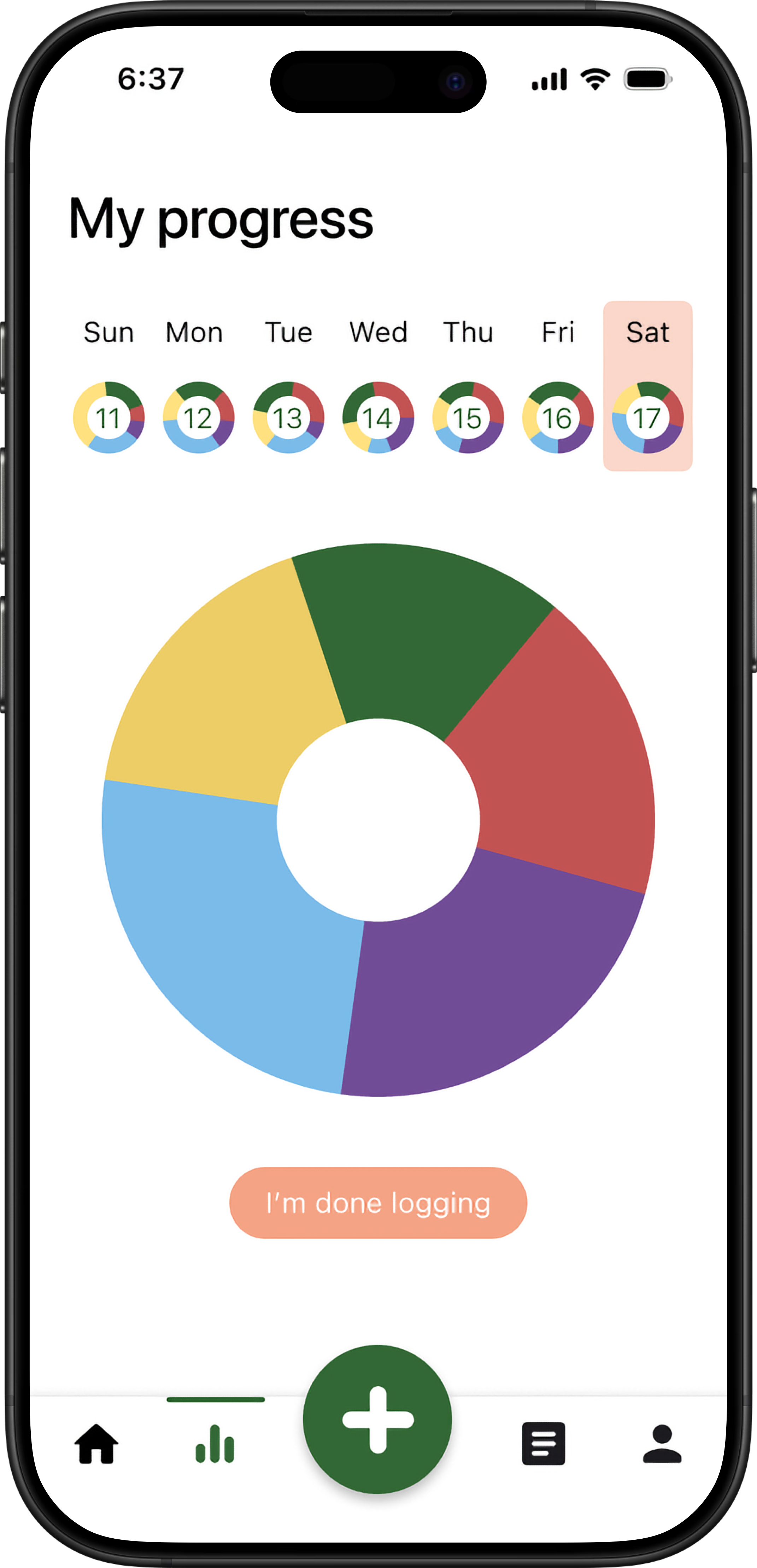
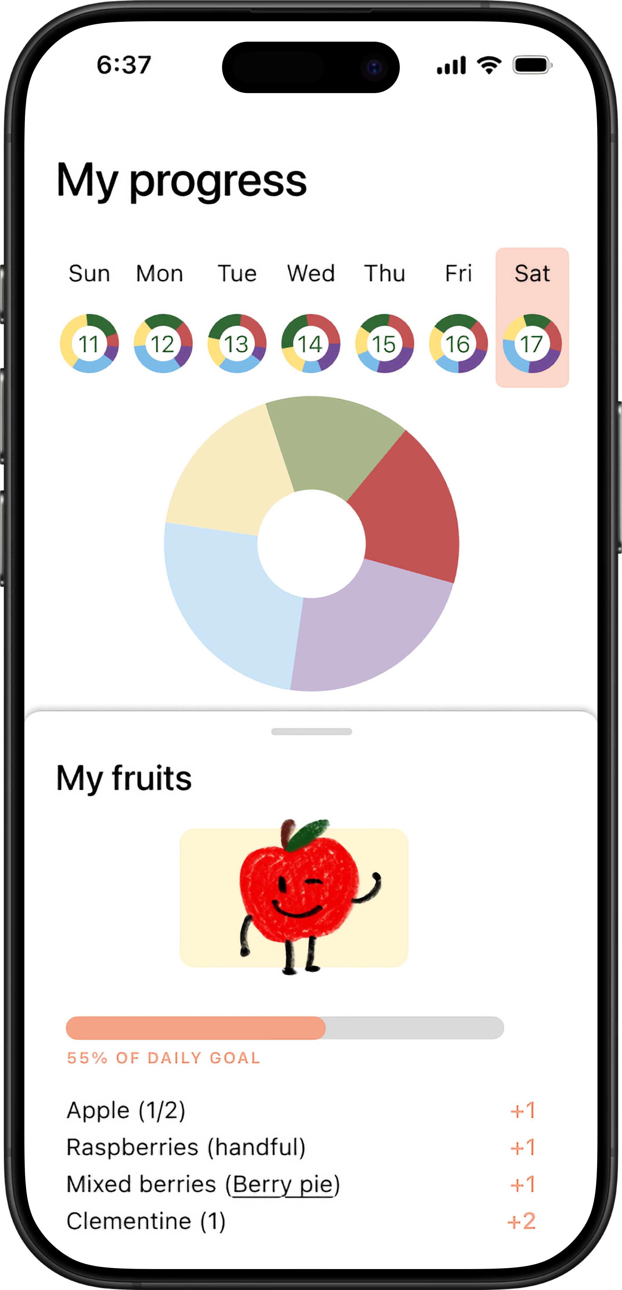
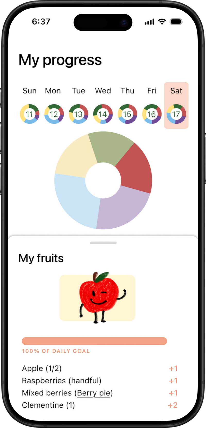
Home and Progress
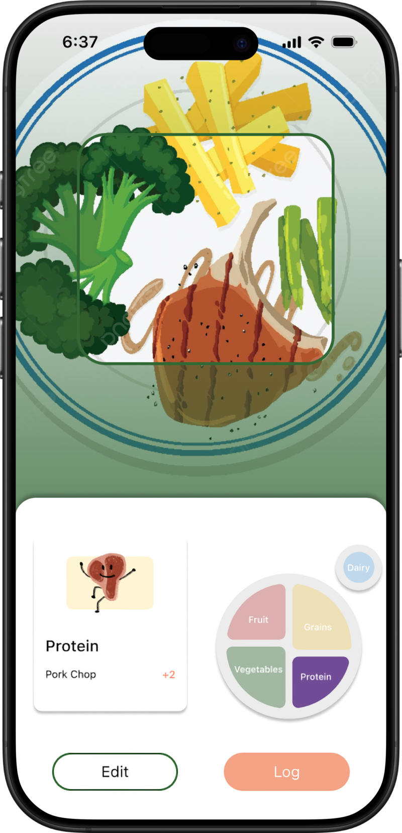
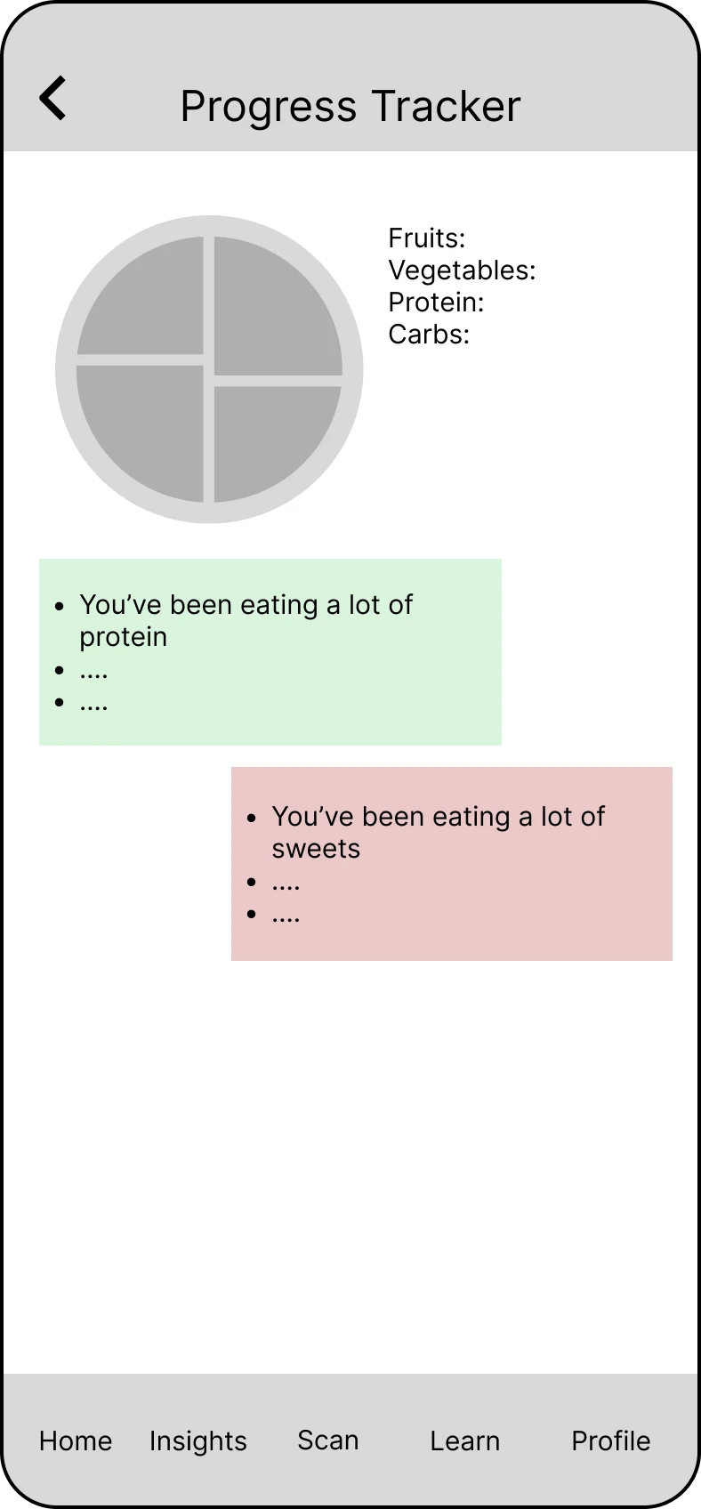
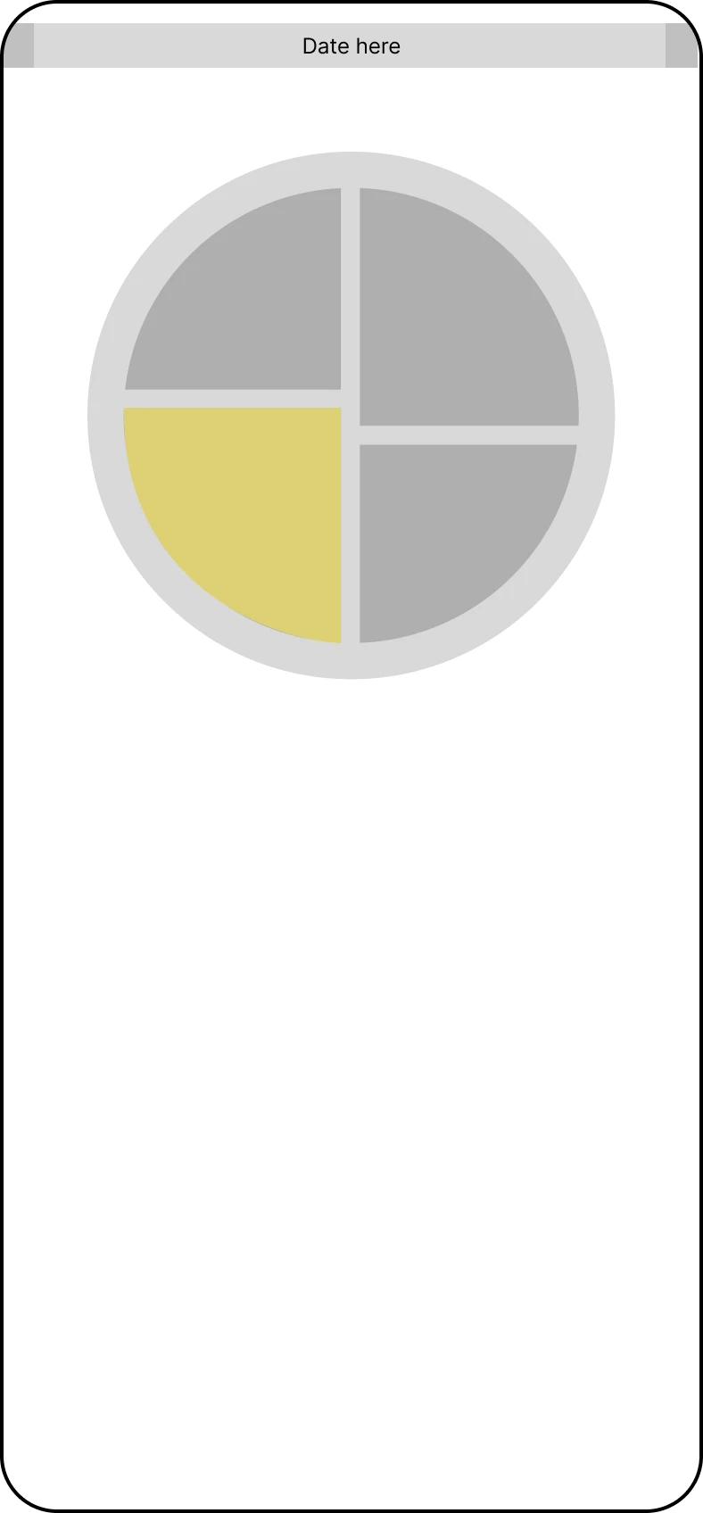
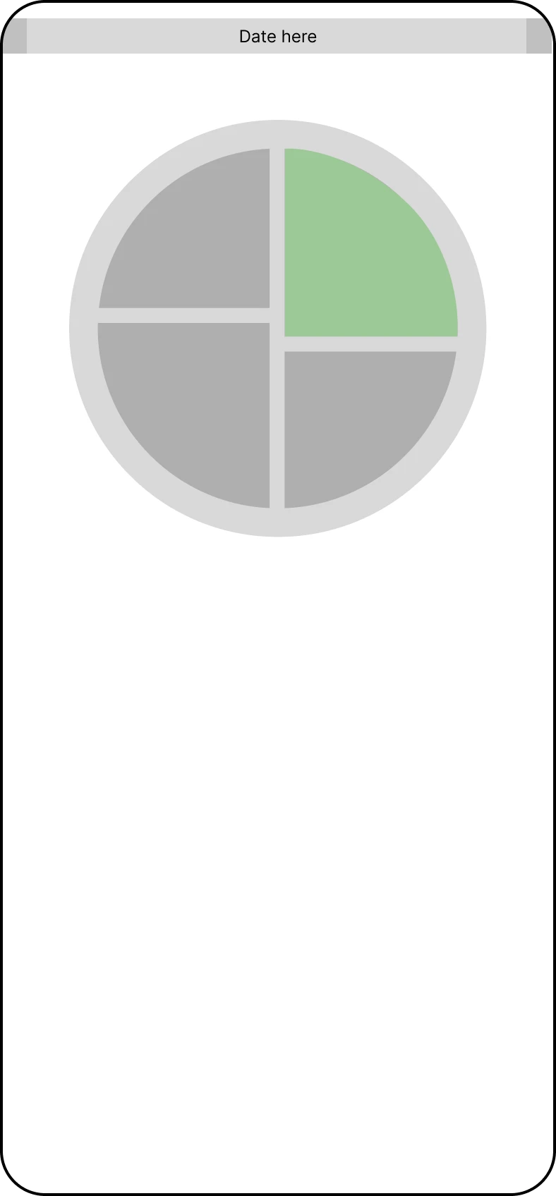
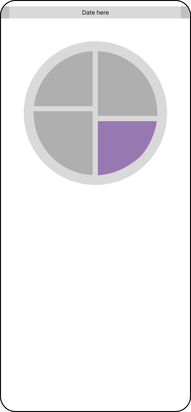
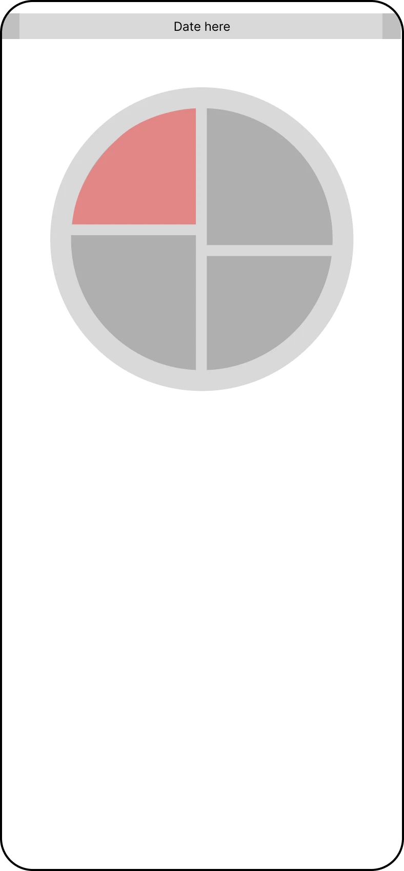
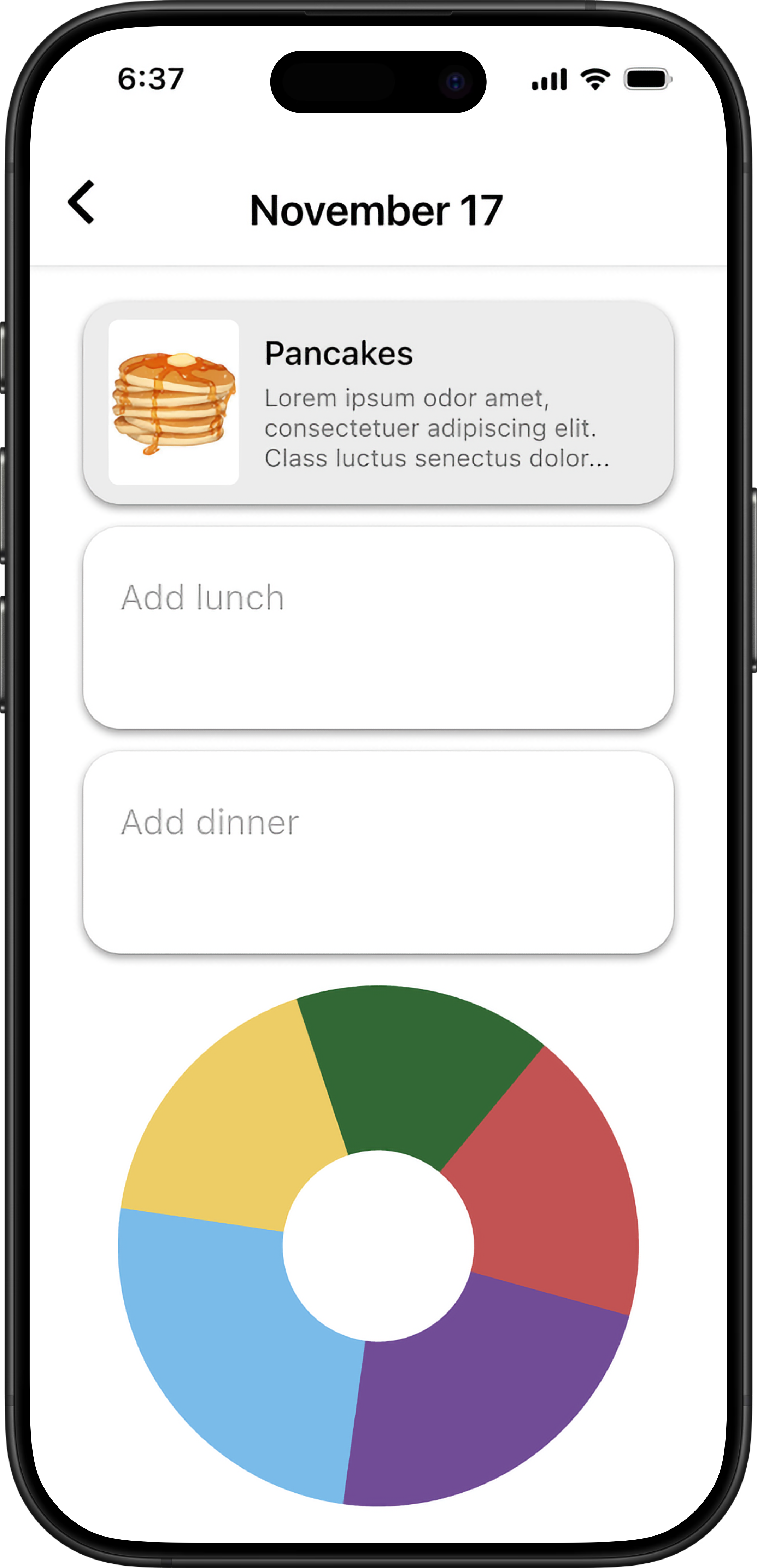
The homepage displays a calendar view where users can click on any date to see their meals for that day. From here, they can access their daily meals and the interactive pie chart to visualize their nutritional balance. Clicking into the pie chart reveals detailed insights about their eating patterns, showing which food groups they've been consuming most—whether it's protein, sweets, or other categories.
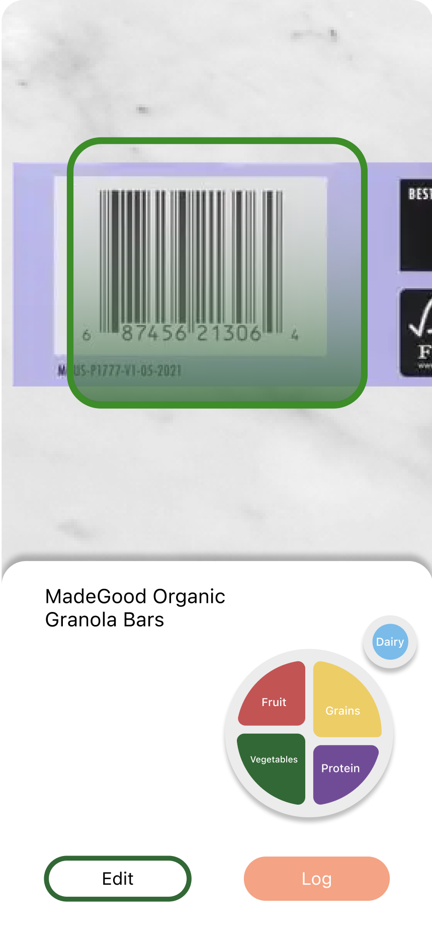
Scan Food
Quick food logging through camera scanning and manual entry options.
Insights
Visual analytics and progress tracking with food group breakdowns and trends.
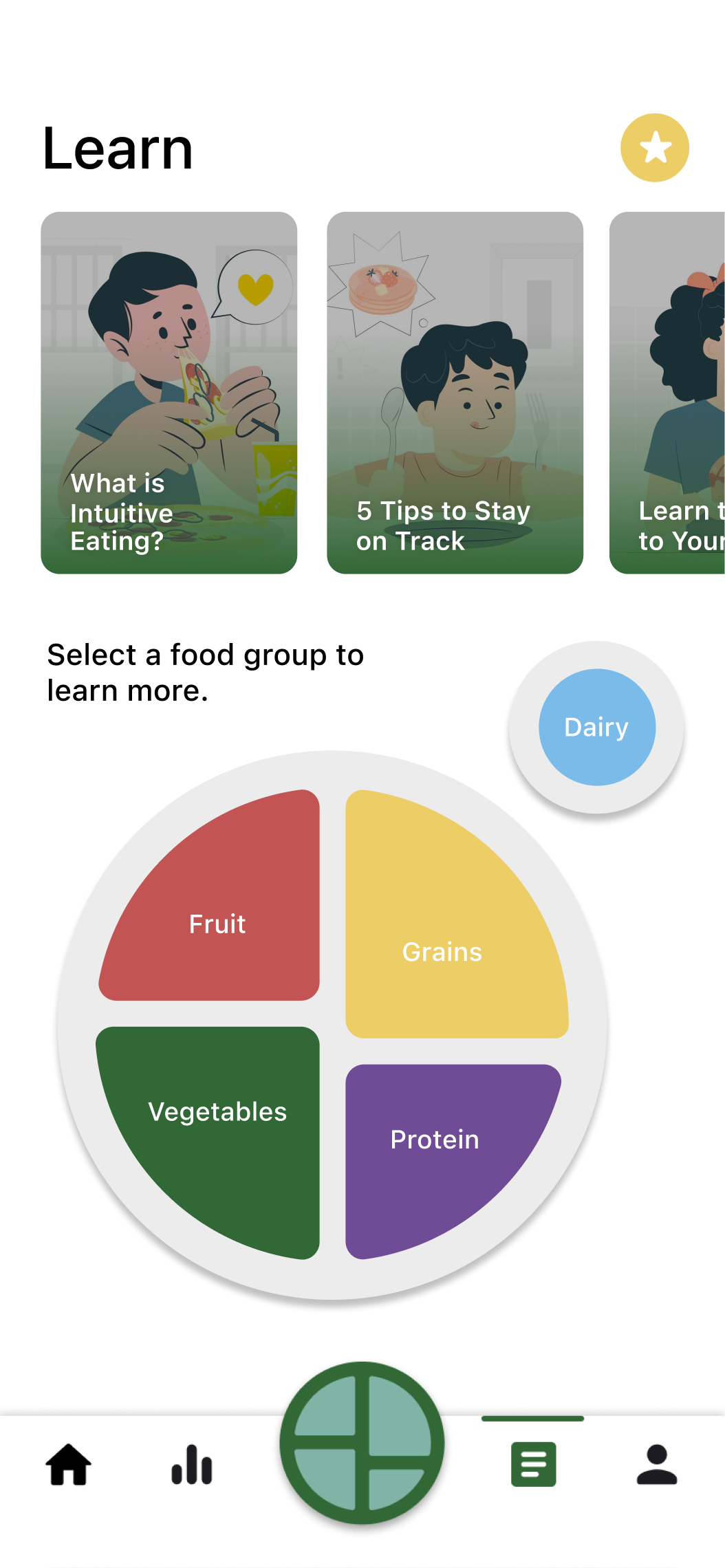
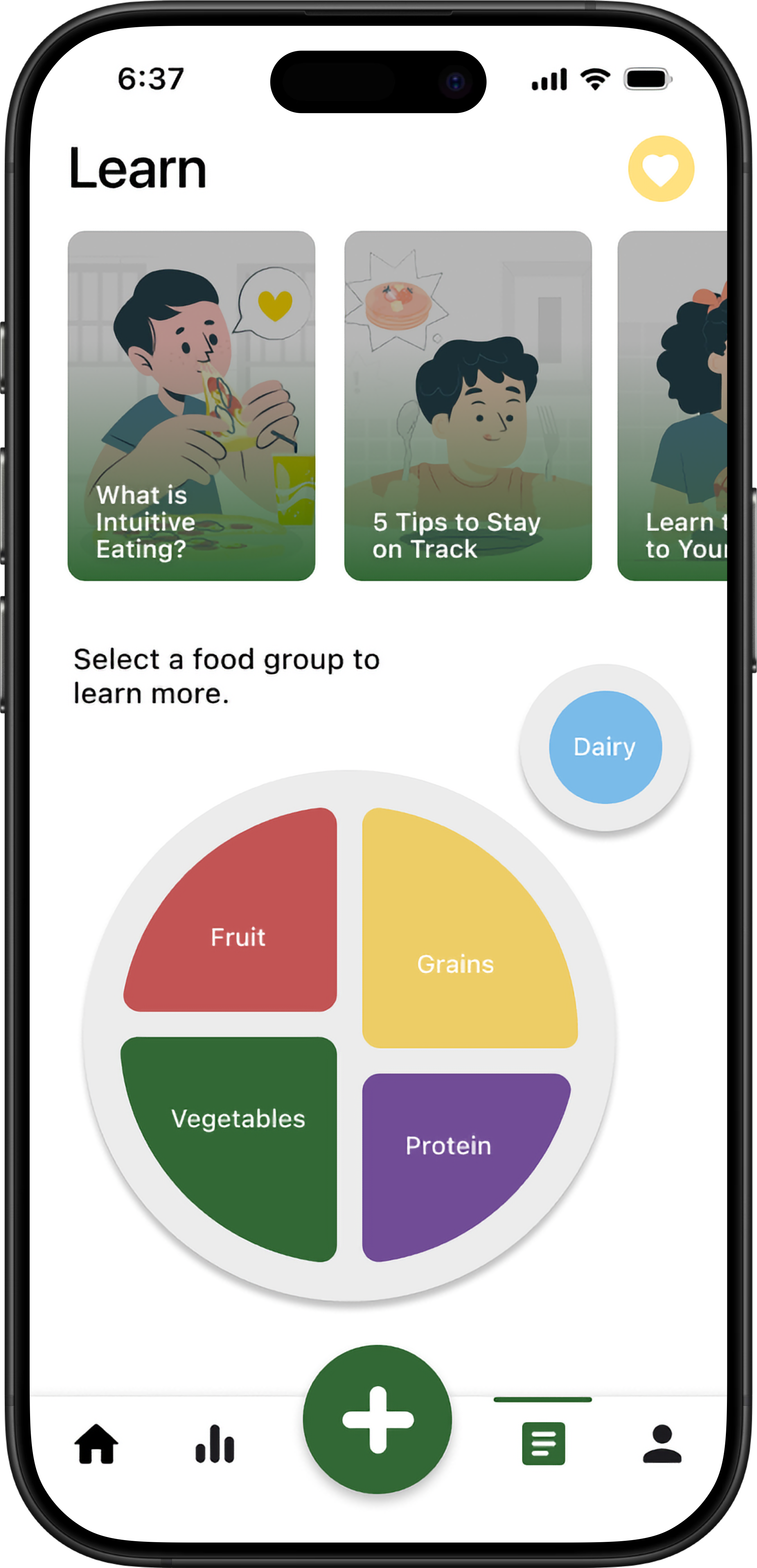
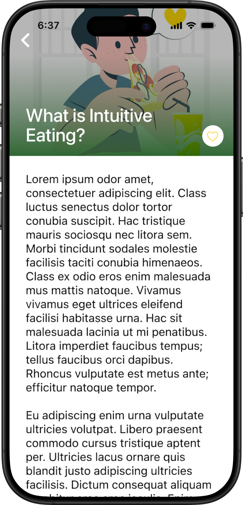
Education
Educational content and tips for building healthy eating habits and nutrition knowledge.
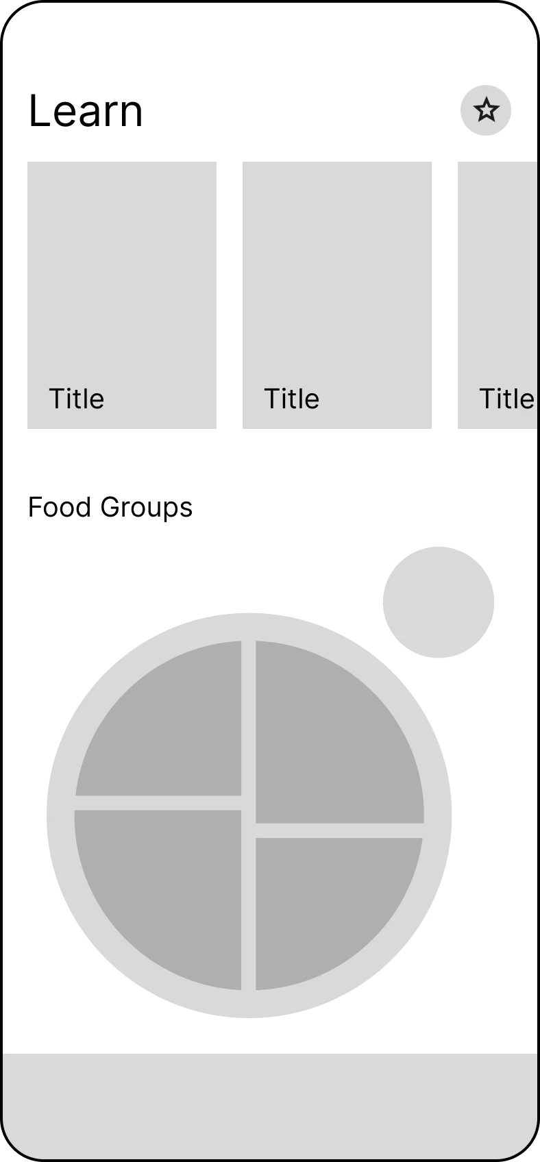
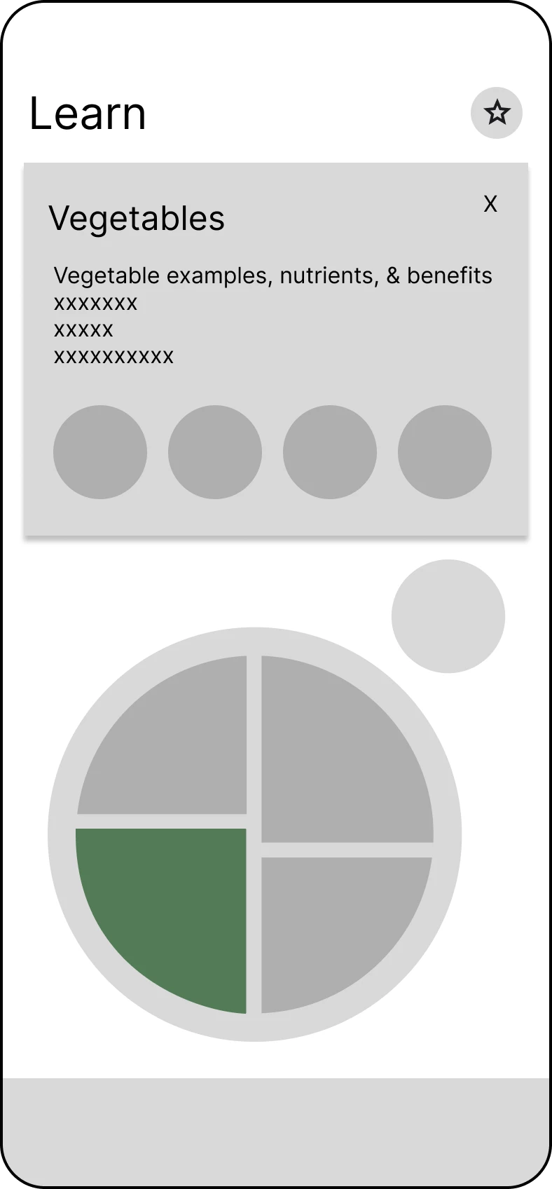
Interactive Pie Chart
Interactive visualization of food group percentages and nutritional balance.
Our design system prioritizes inclusivity and playfulness.
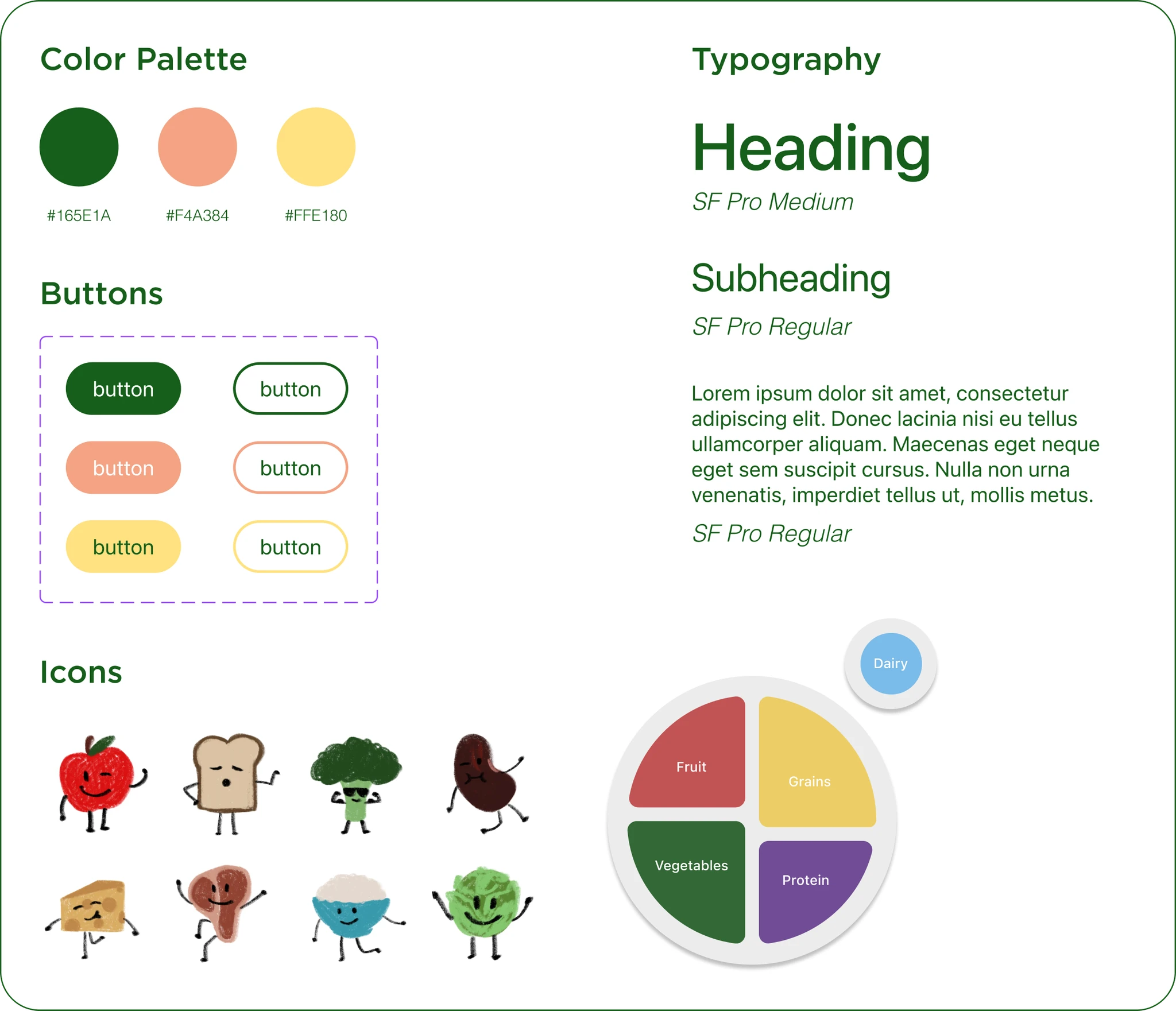
The design system incorporates inclusive design principles, particularly in the app's illustrations. The cute food characters representing different food groups are designed to reflect diverse cultural food preferences and dietary needs. This ensures that users from various backgrounds and with different dietary restrictions feel represented and included within the app experience. These playful food characters also contribute to the overall lighthearted and engaging tone of the app, making the experience more enjoyable and less intimidating.
The color palette, consisting of green, peach, and yellow, further reinforces this bright and playful aesthetic.


Now came transforming our wireframes into a polished design.
Education
.png)
.png)
Insights Version 1
Insights Version 2
This version gamified the process of eating different food groups by representing each food group as character-like badges that users could "earn" by logging their meals. Progress bars and points further incentivized healthy eating.
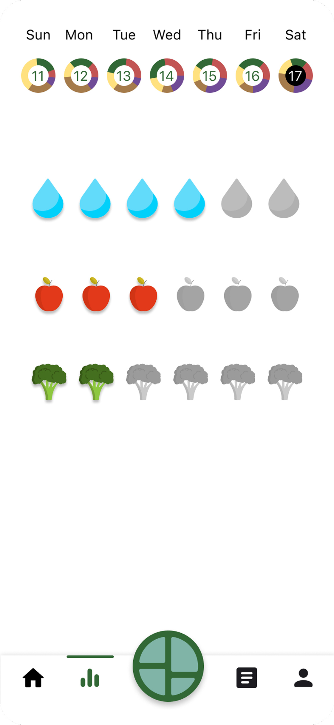
Insights Version 3
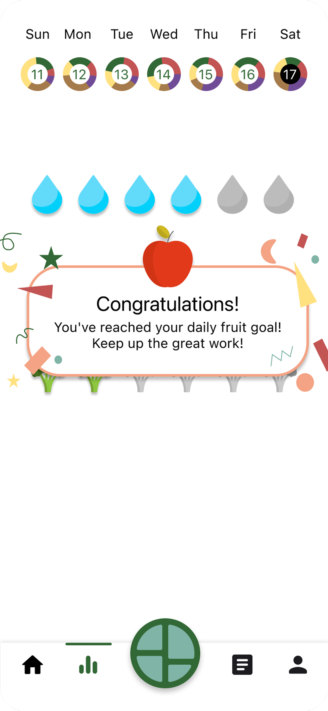
This version focuses on habit tracking, where users can click on greyed icons to "fill" them in once goals are completed. The insights at the top show food group completion over time, providing a clear view of progress.
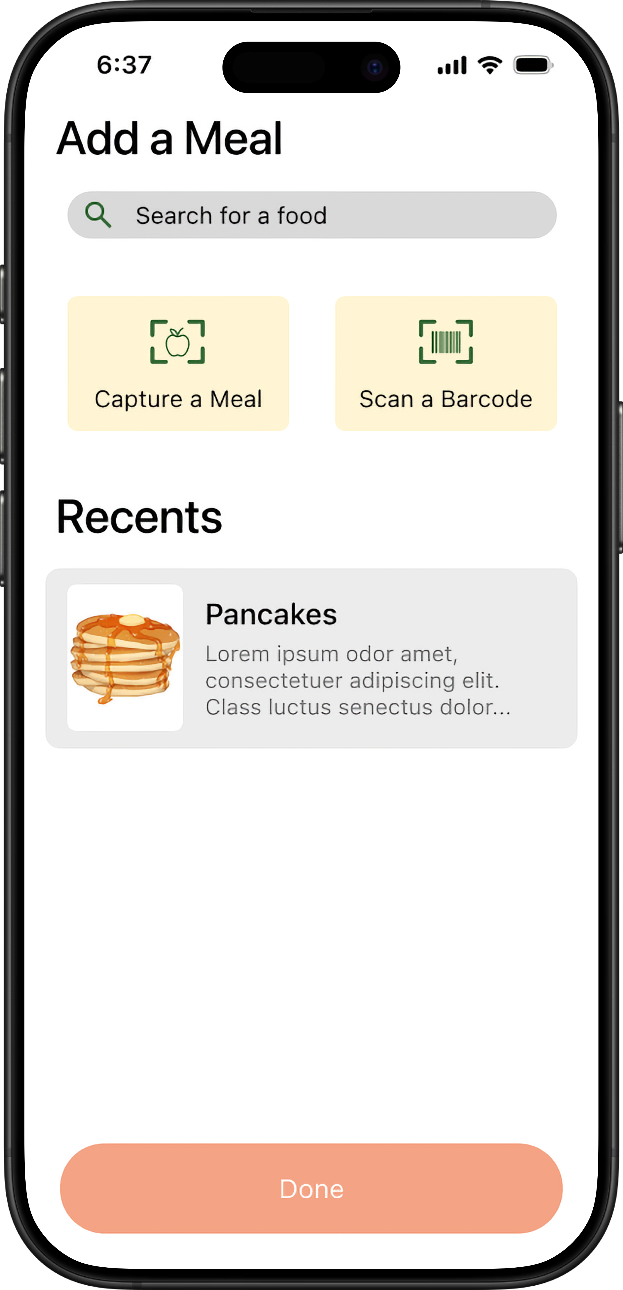
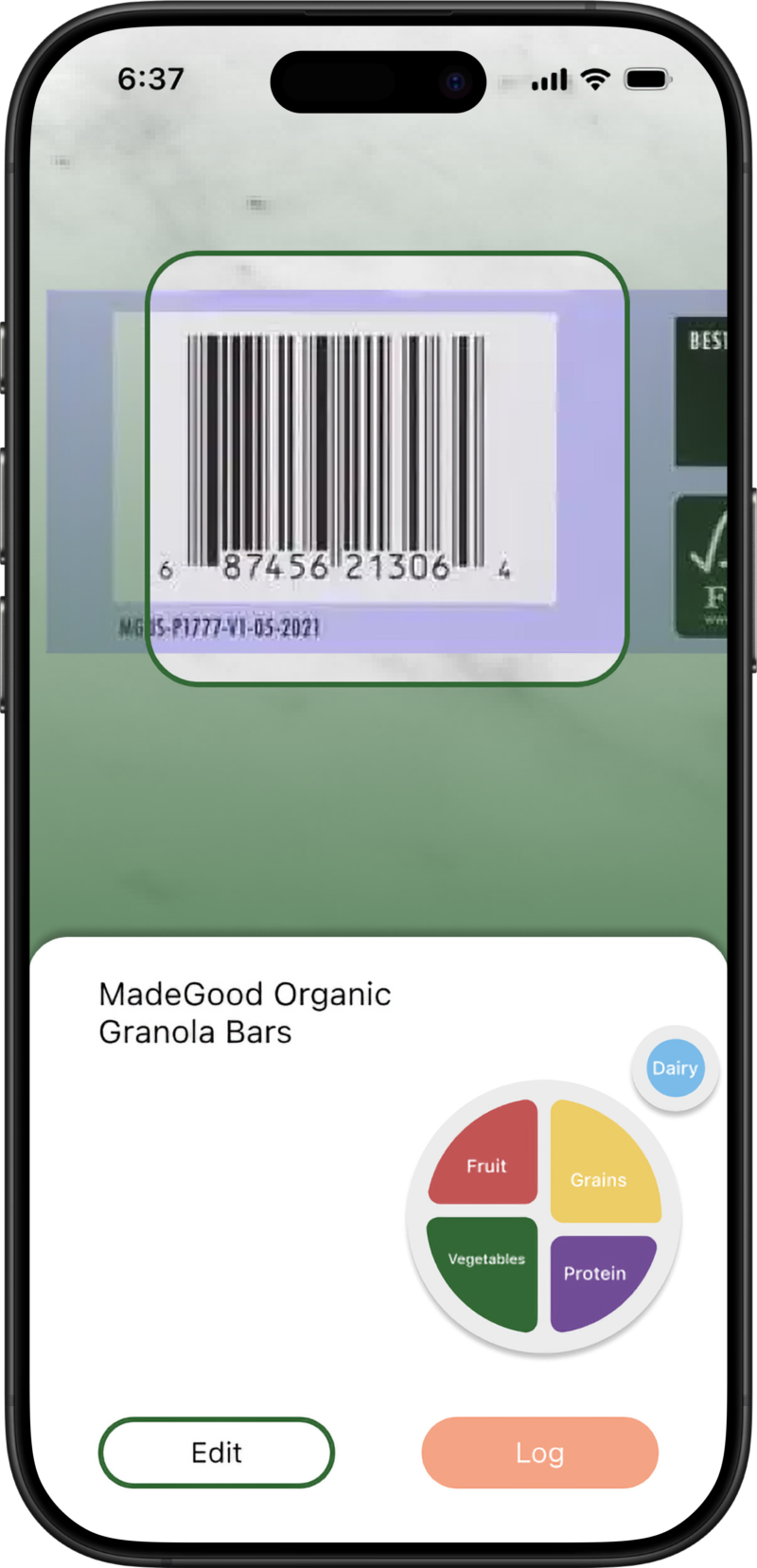
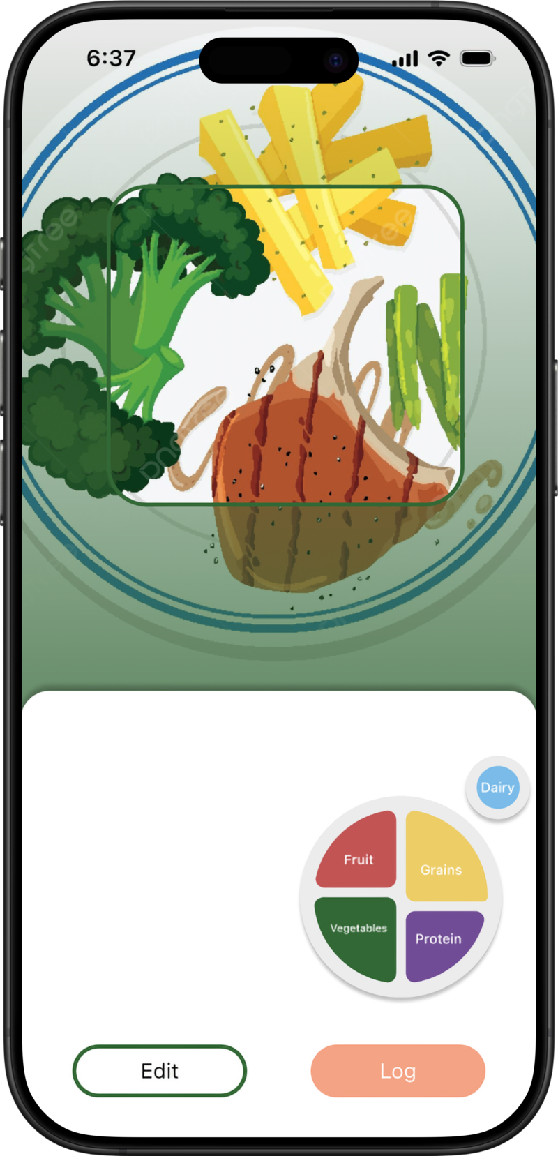
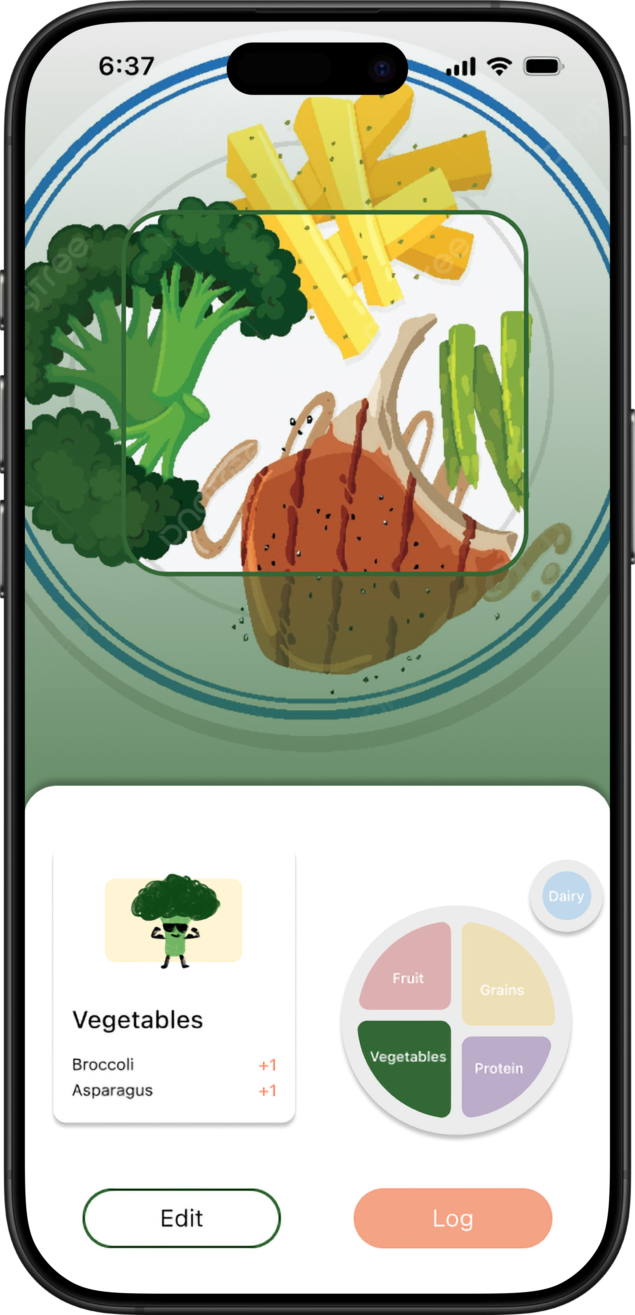
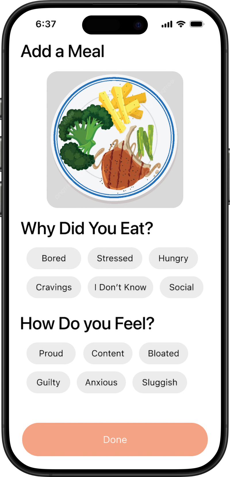
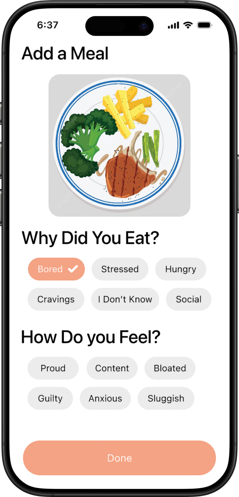
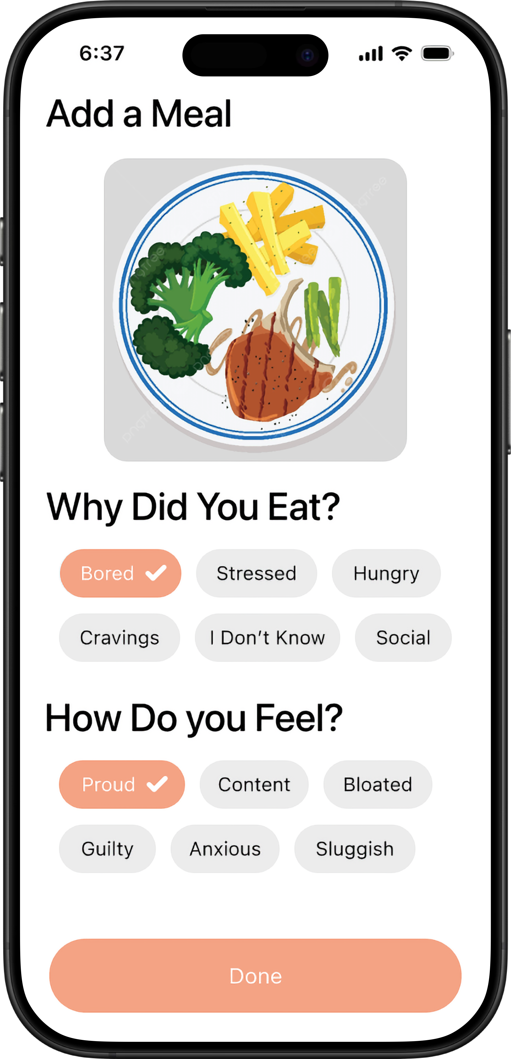
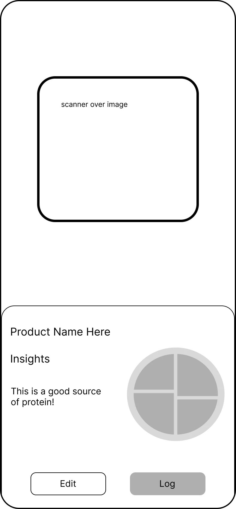
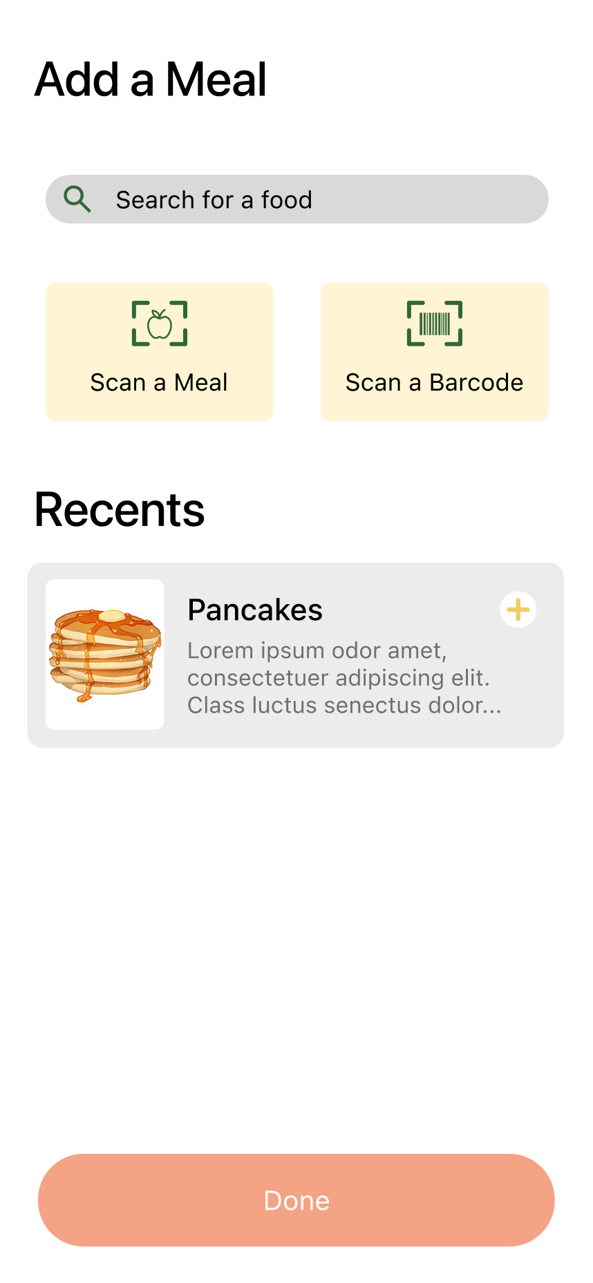
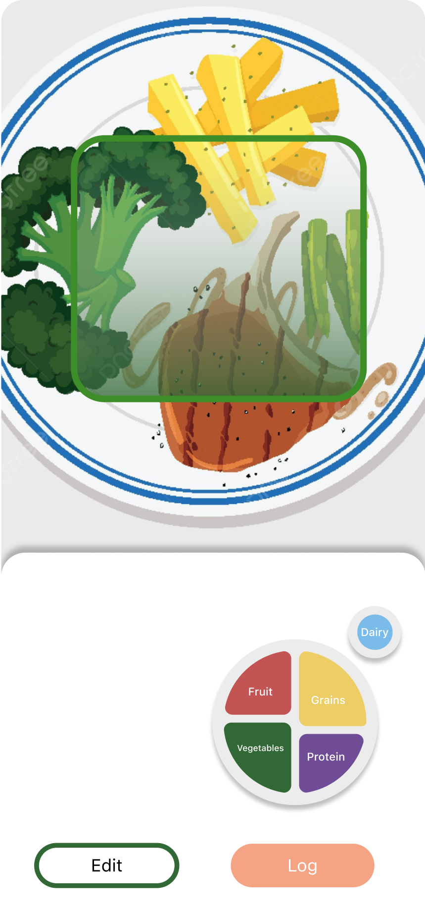
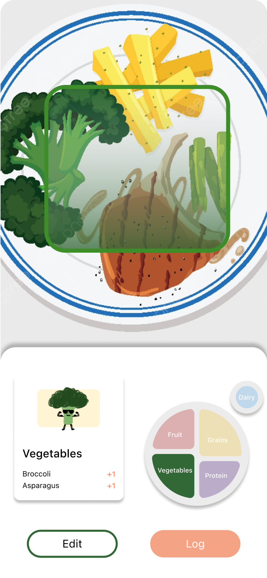
Add a Meal
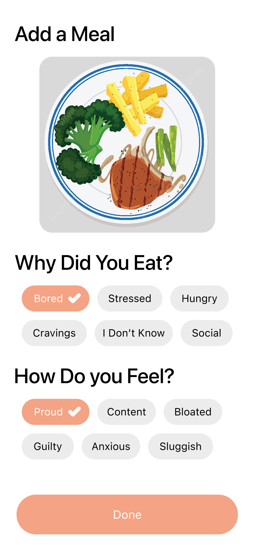
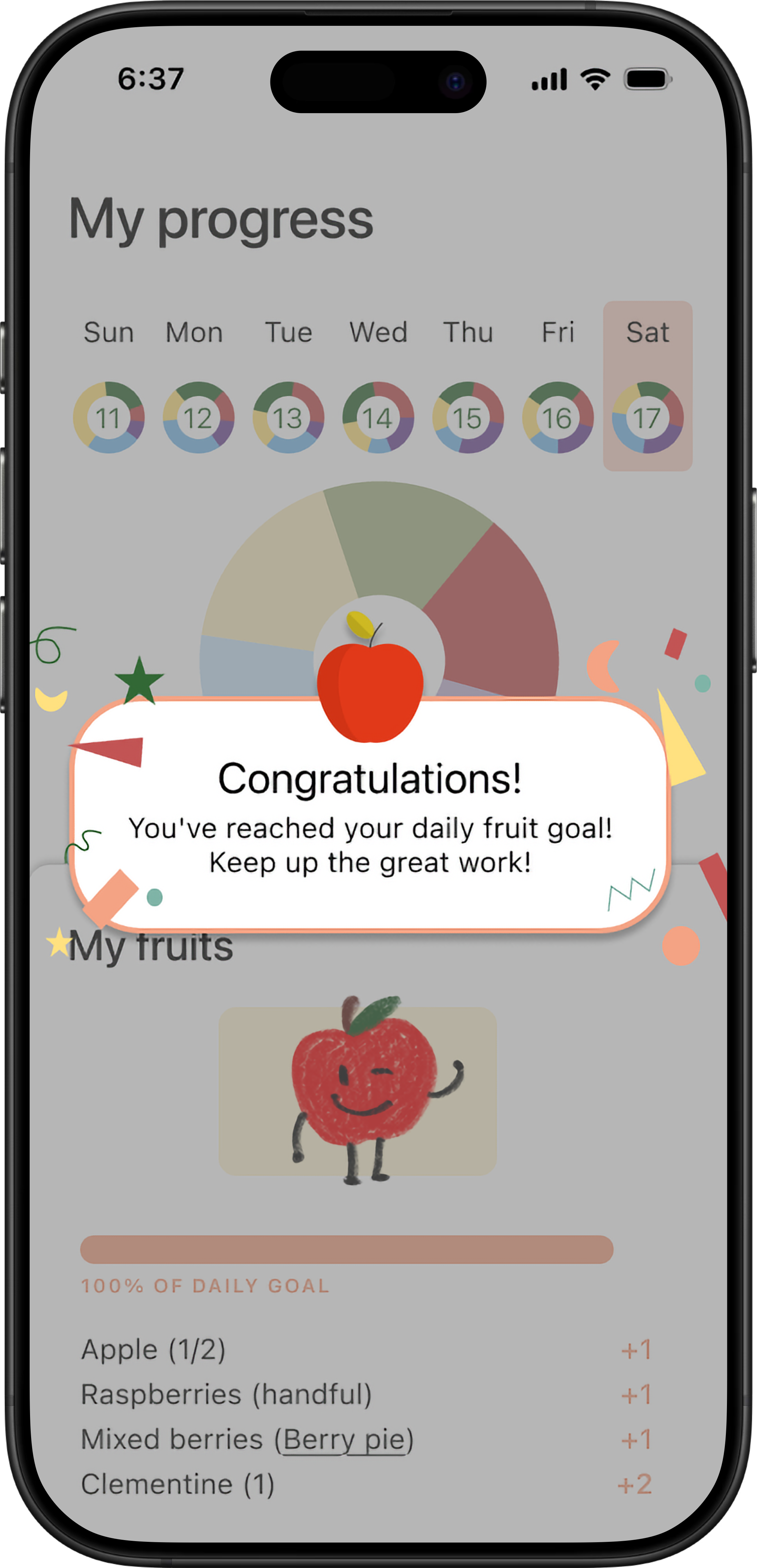
We designed four convenient methods for meal logging: search, meal scan, barcode scan, and quick add, ensuring a seamless user experience. Once a meal is logged, users can instantly see its impact on their daily food group progress. Users are also prompted to describe why they ate the meal and how they felt after eating, encouraging mindful reflection on their eating habits.
We user tested each high-fidelity flow before finalizing our prototype.
We user tested our high-fidelity designs with 10 participants to validate our design decisions and identify areas for improvement. Participants interacted with printed flows of the "Add a Meal" flow, the "Learn" flow, and three variations of the "Insights" flow. Our goal was to identify which elements of each Insights version resonated with users most.
Navigation Clarity
- A recurring issue was the unclear function of the middle button on the navigation bar. Many participants mistook it for a home button rather than the "Add Meal" function.
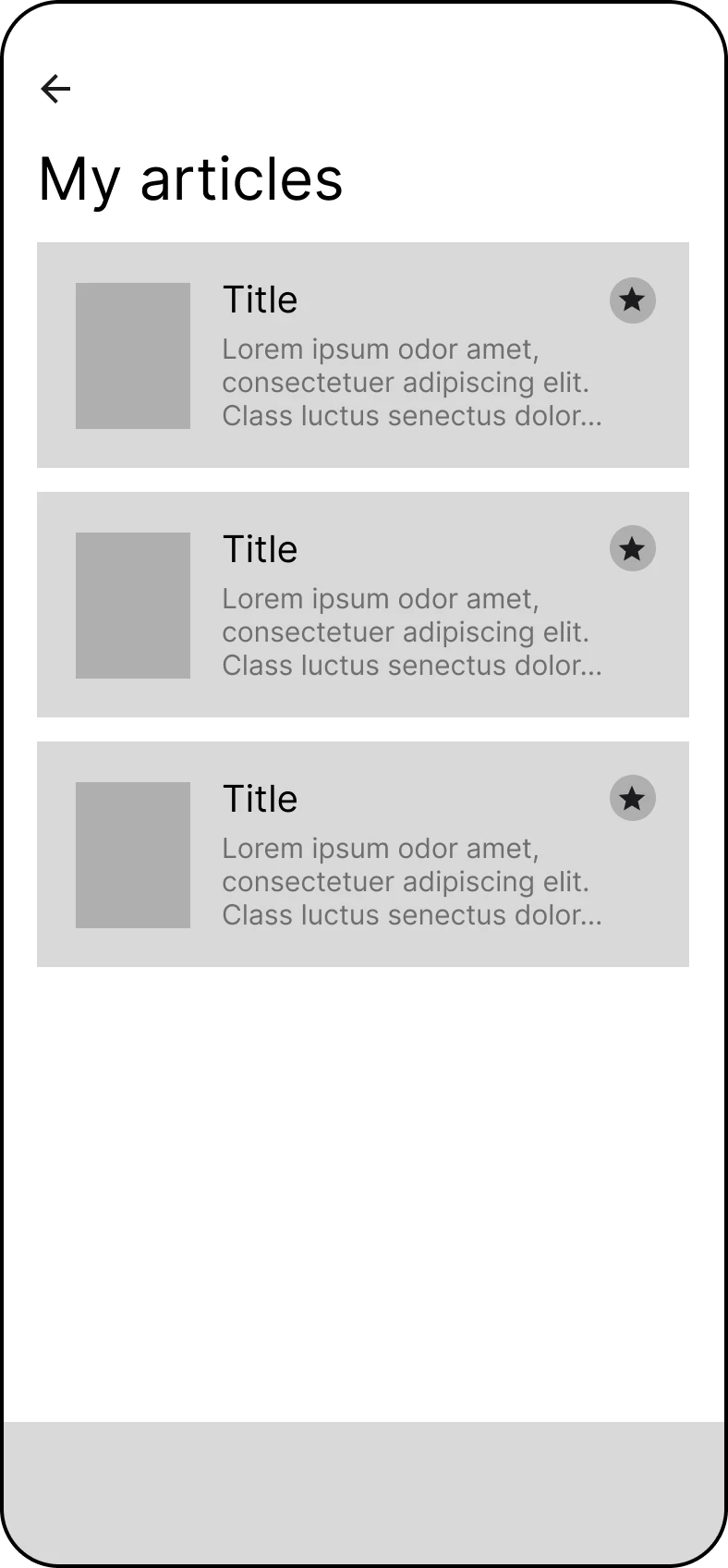
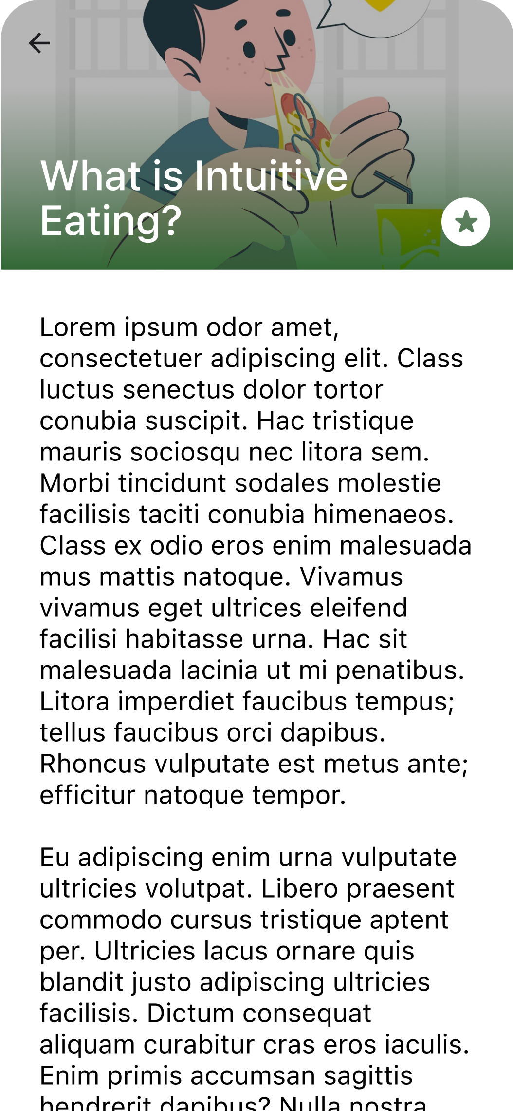
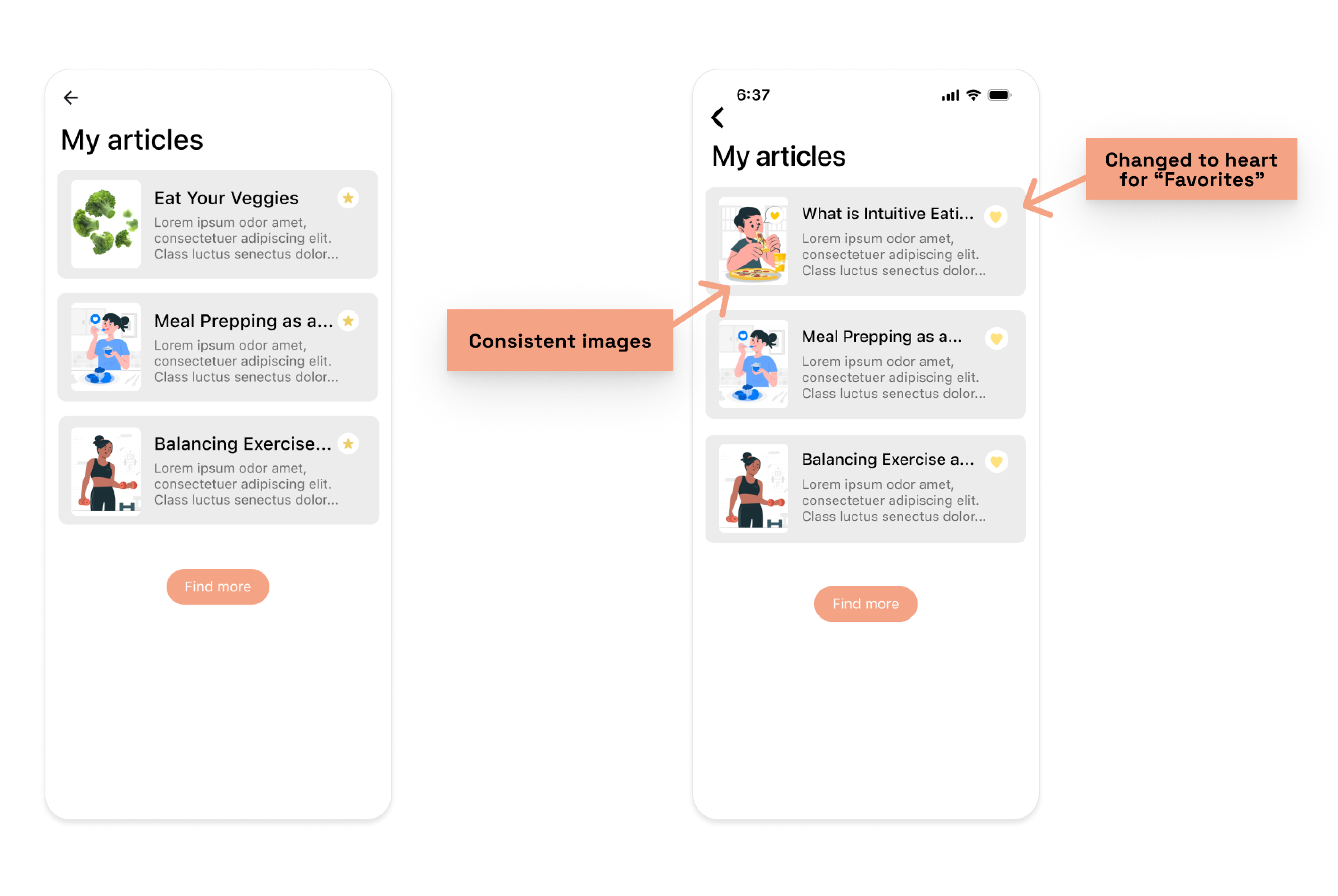
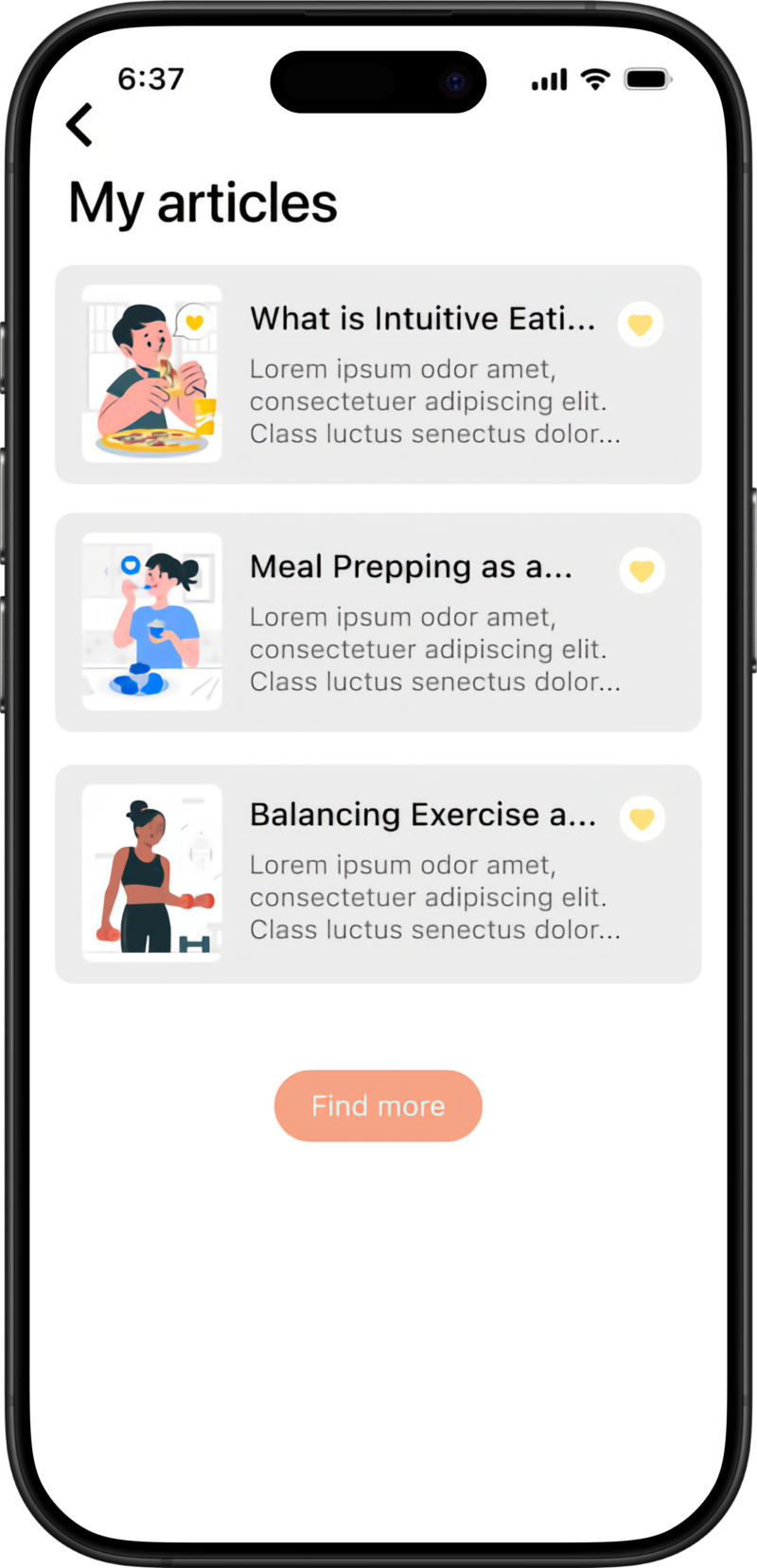
"Learn" Flow
- The star icon in the "My Articles" section was misinterpreted as a premium feature indicator. Additionally, some users felt that certain images in this section did not align with the app's overall aesthetic.
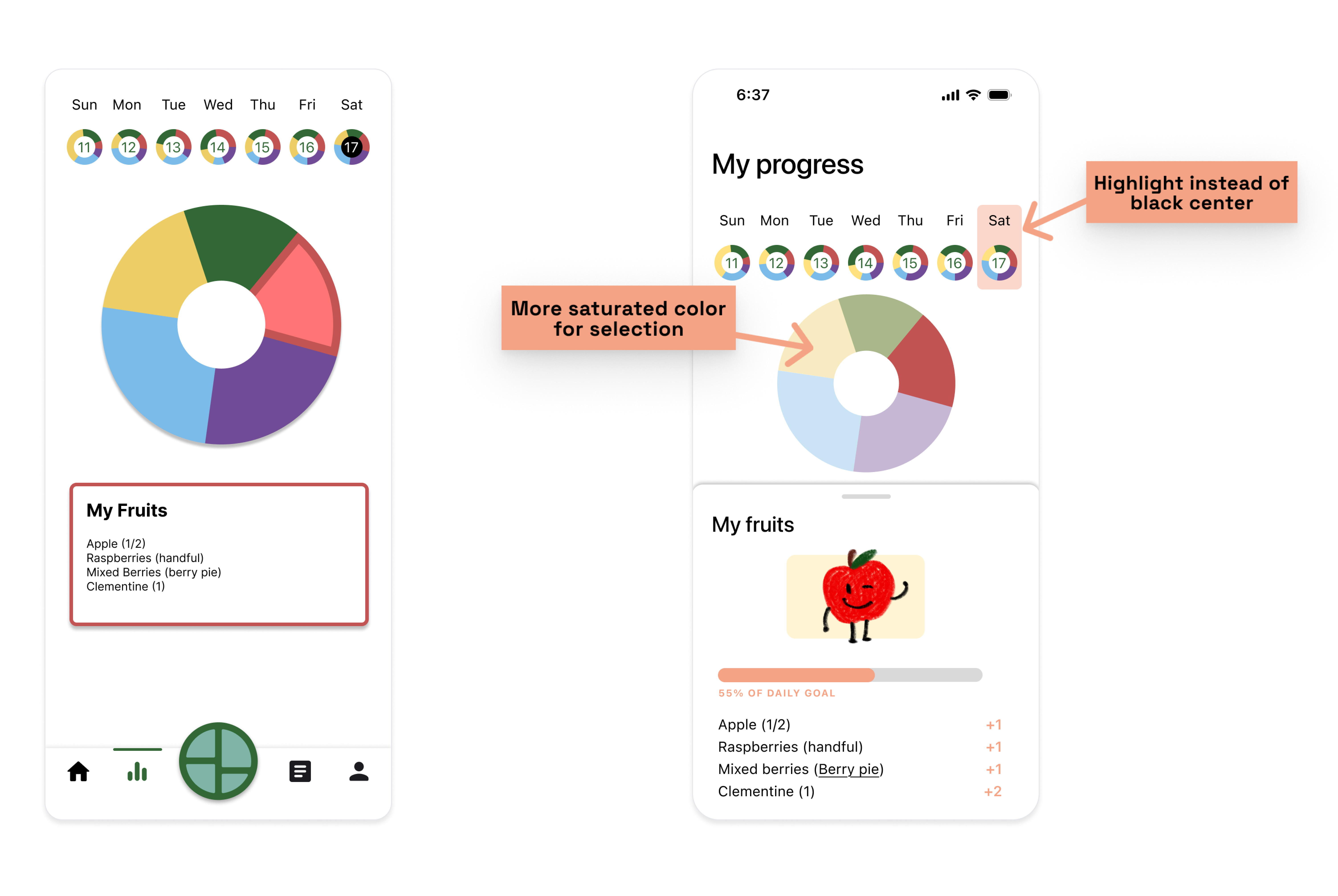
"Insights" Flow - Version 1 (Pie Chart)
- While the pie chart was recognized as a helpful visualization of food group intake, it felt too formal compared to the playful character icons used elsewhere.
- Users also noted that the color contrast within the pie chart was insufficient, making it difficult to discern changes when clicking on sections.
- Some participants suggested integrating the character icons into this version to increase playfulness.
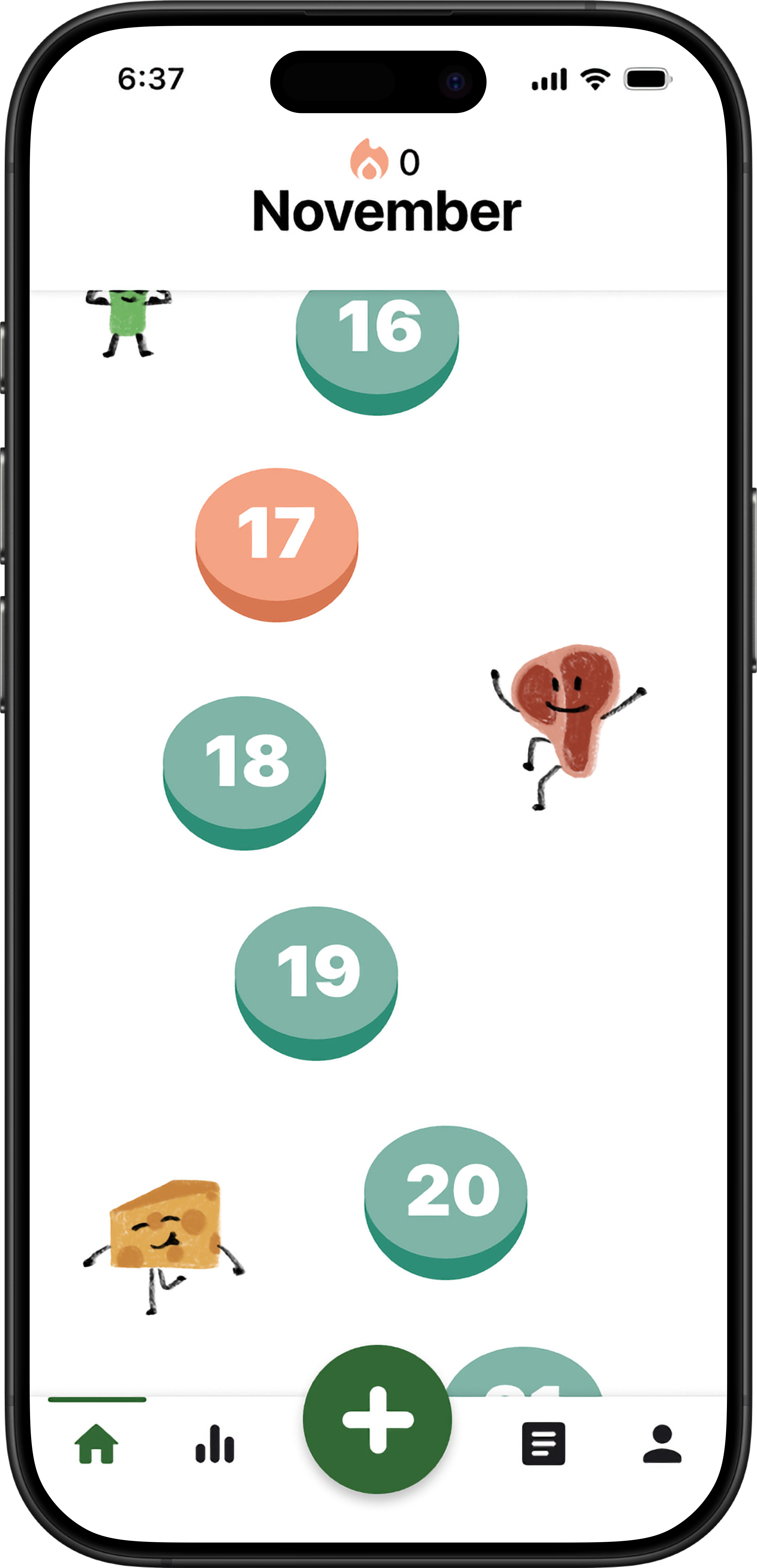
"Insights" Flow - Version 2 (Gamified Badges)
- This version, with its character-based food badges, was the most popular among participants. They found it engaging and motivating.
- However, the meaning of the stars and buttons next to the progress bar was unclear. Some users were unsure whether the star was a favorite button or something else, and the add button's function (whether it opened a new page or directly added food) was ambiguous.
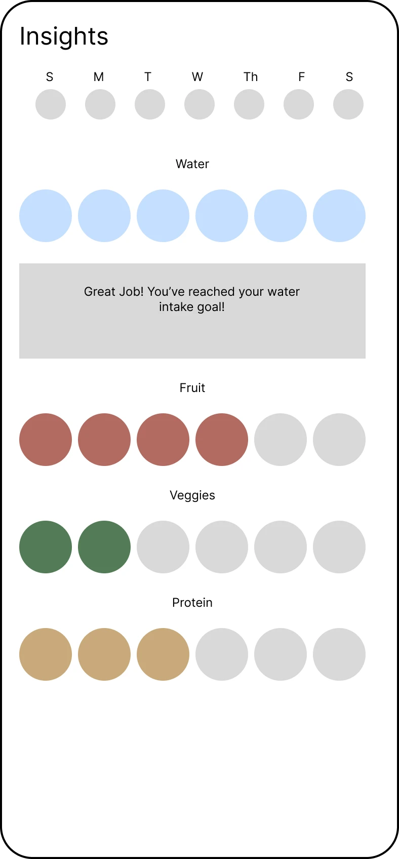
"Insights" Flow - Version 3 (Icon Progress Bar)
- This version was understood to represent food categories, but some users felt it was too prescriptive, as the limited number of icons (six per category) seemed to suggest a specific quantity of each food group to consume.
- The dark color of the small disks around the dates was also noted as a visual inconsistency with the brighter color scheme.
- The black middle on the "selected" date was also disliked.
Impact on Design
The navigation bar's middle button was redesigned with a clearer "+" icon to indicate the "Add Meal" function.
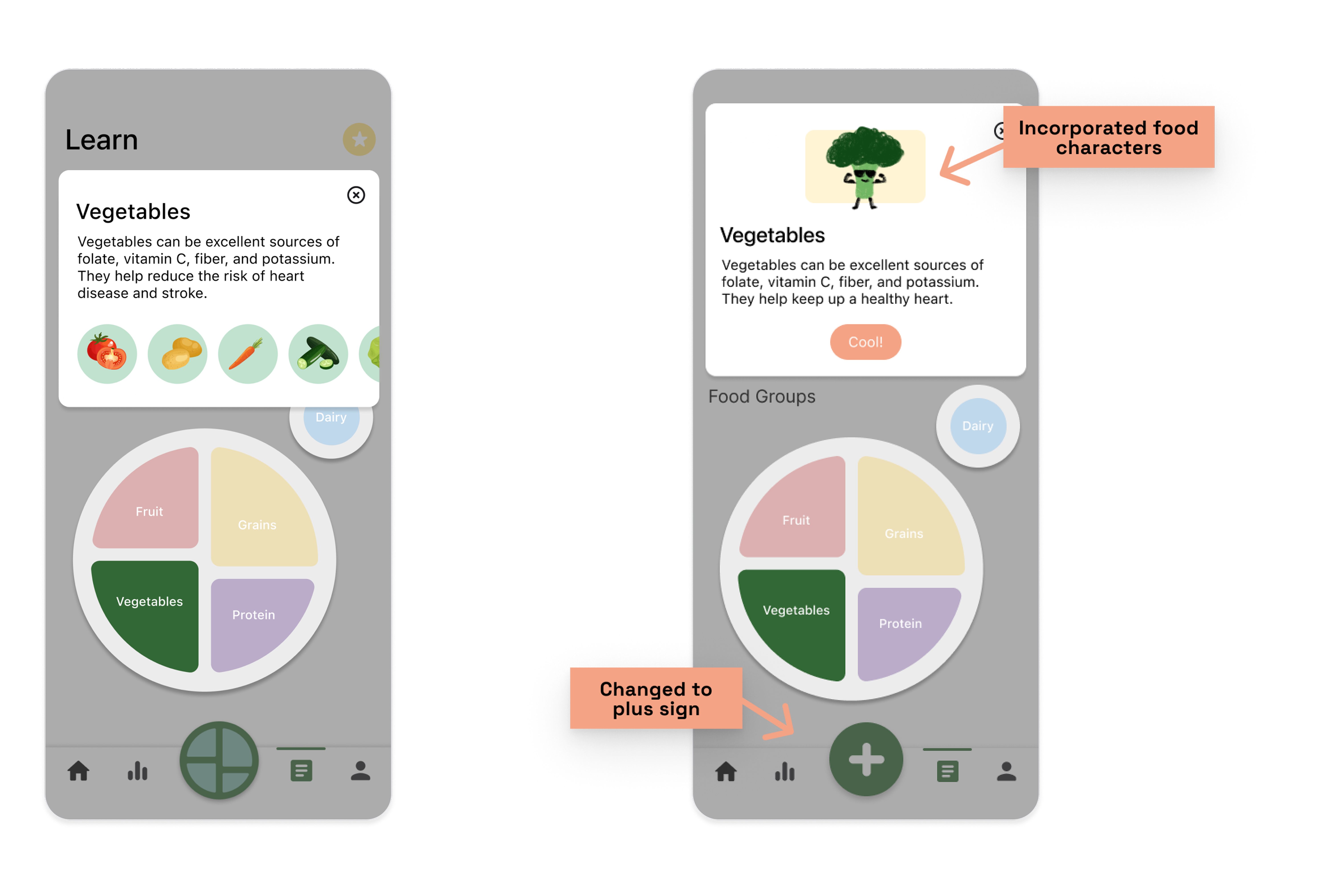
The star icons in the "Learn" flow were replaced with hearts to signify "favorites," and the images were reviewed for aesthetic consistency.
The color contrast within the pie chart was improved. We also consolidated different versions of "Insights" into a single, unified "My Progress" experience—combining the visual clarity of Version 1, the motivational, character-driven elements of Version 2, and the simplicity of Version 3 with motivational notifications. This approach brought together the best aspects of each version for a more engaging and clear user experience.
Click through the flows to experience HealthSum in action.
Conclusion
HealthSum is a playful and inclusive nutrition app that turns food tracking into a more positive, personal, and emotionally aware experience. Instead of focusing on calories, our final design celebrates balance, variety, and how food makes our users feel—with features like badges, mood-based logging, and an accessible, gamified experience.
This project pushed me to grow in all the best ways. I got better at interviewing, thinking inclusively, and staying open when designs had to shift directions. I'm especially proud of how our visual system and interactions brought the concept to life and resonated with users. If I could expand on this prototype, I'd love to explore more ways to help users see emotional patterns over time, so that their moods and relationships food could tell a story throughout their journey.
Final Flows
Home
My Progress

Learn
Add a Meal