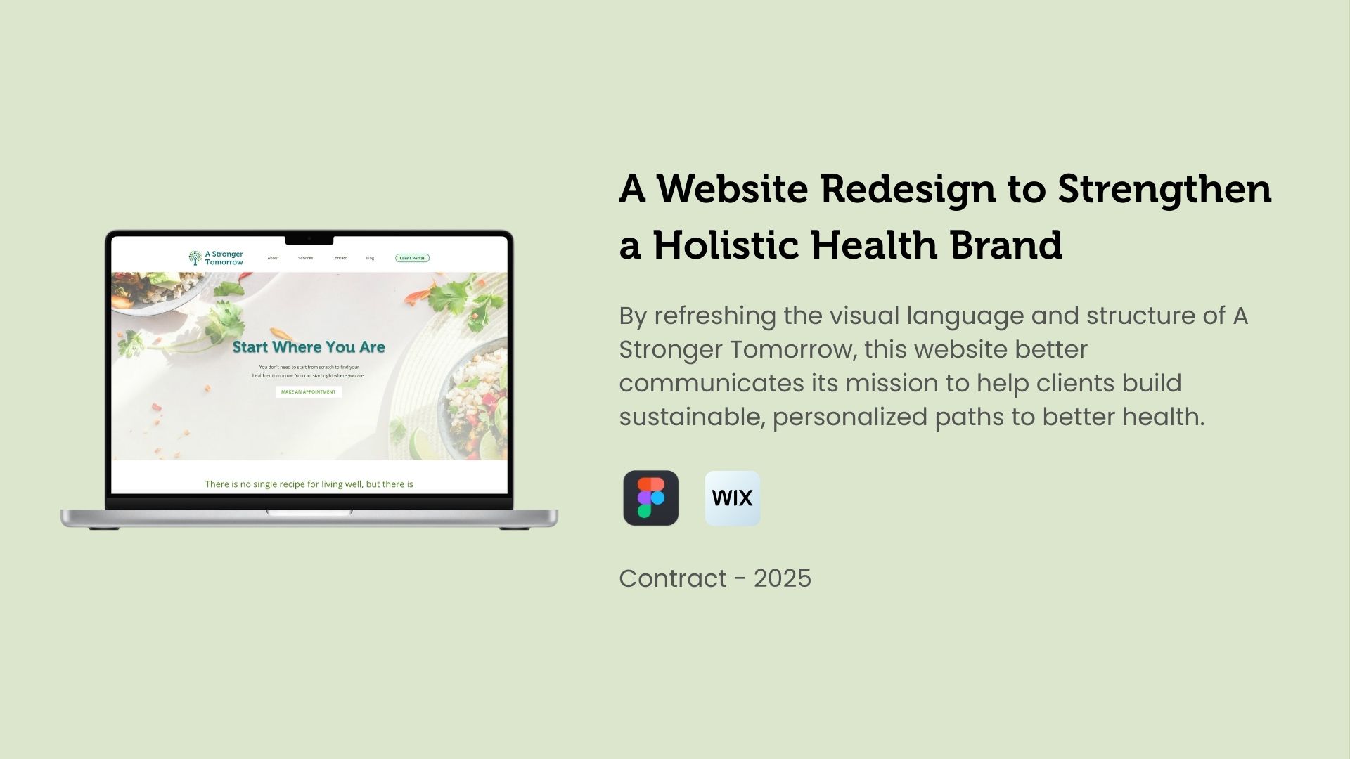
A fresh, intuitive website for a practice built on connection and trust.
A Stronger Tomorrow is a nutrition and wellness practice rooted in evidence-based care, but the original website didn’t reflect that clarity she needed for her site to be successful.
When I first met with Brandi, she told me that many clients didn’t understand the difference between a nutritionist and a registered dietitian, and that her old site wasn’t helping. The previous site was dense, hard to read, and made it difficult for potential clients to understand Brandi’s credentials or book an appointment.
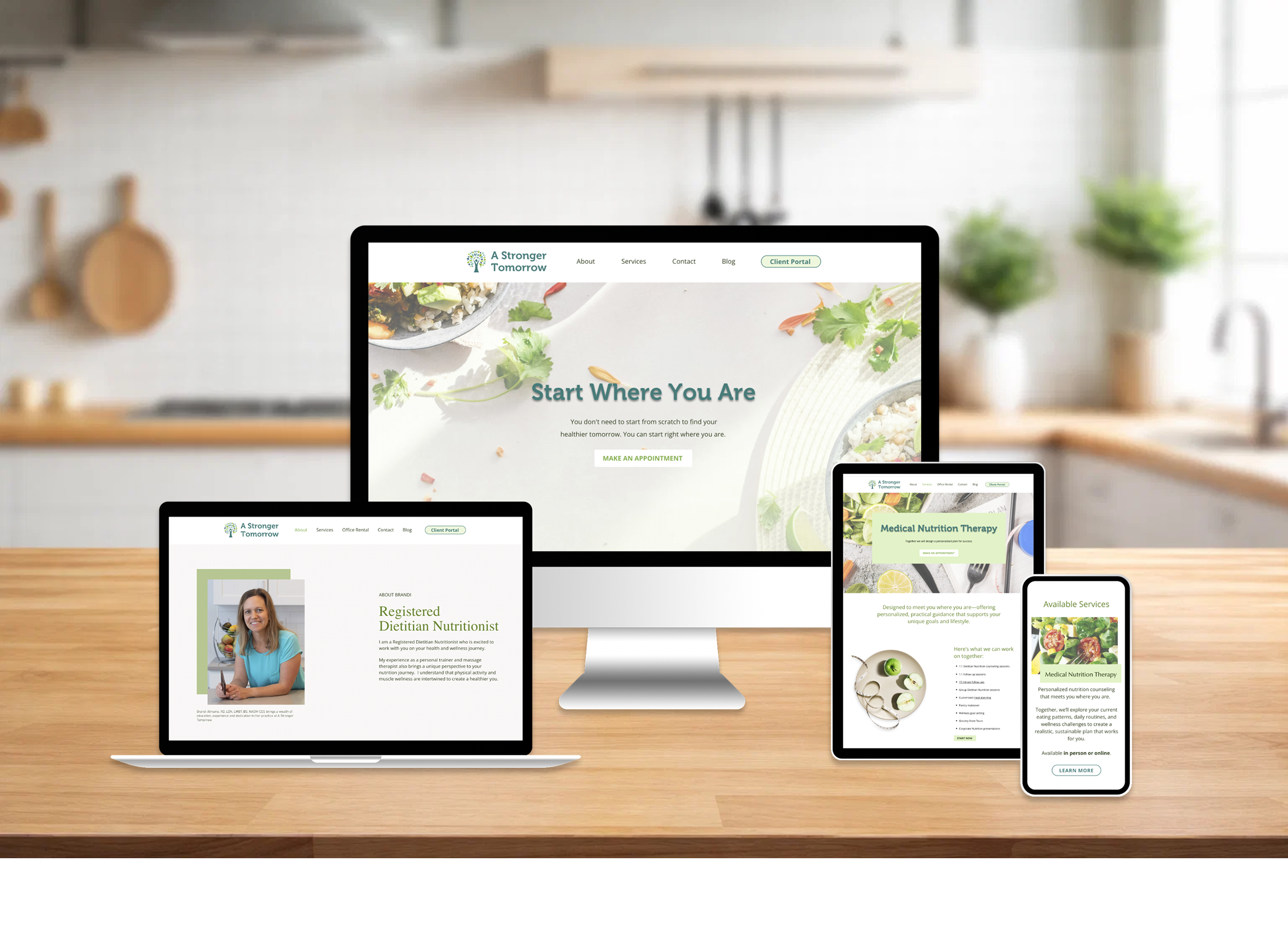
Over the course of one month, I redesigned the website from the ground up. I specifically focused on readability, trust, and a friendlier, more welcoming tone that matched who she is: approachable, experienced, and deeply invested in her clients’ well-being.
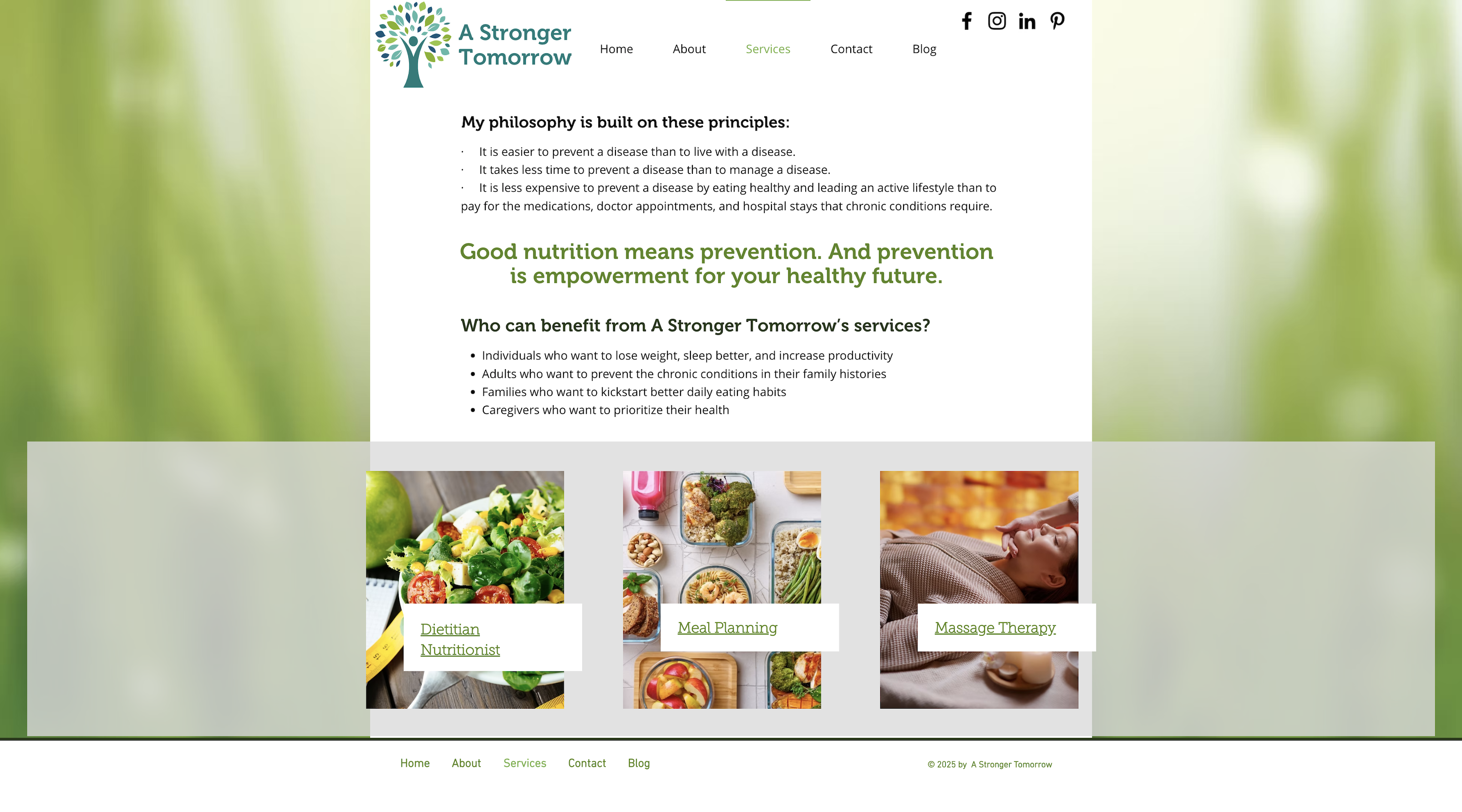
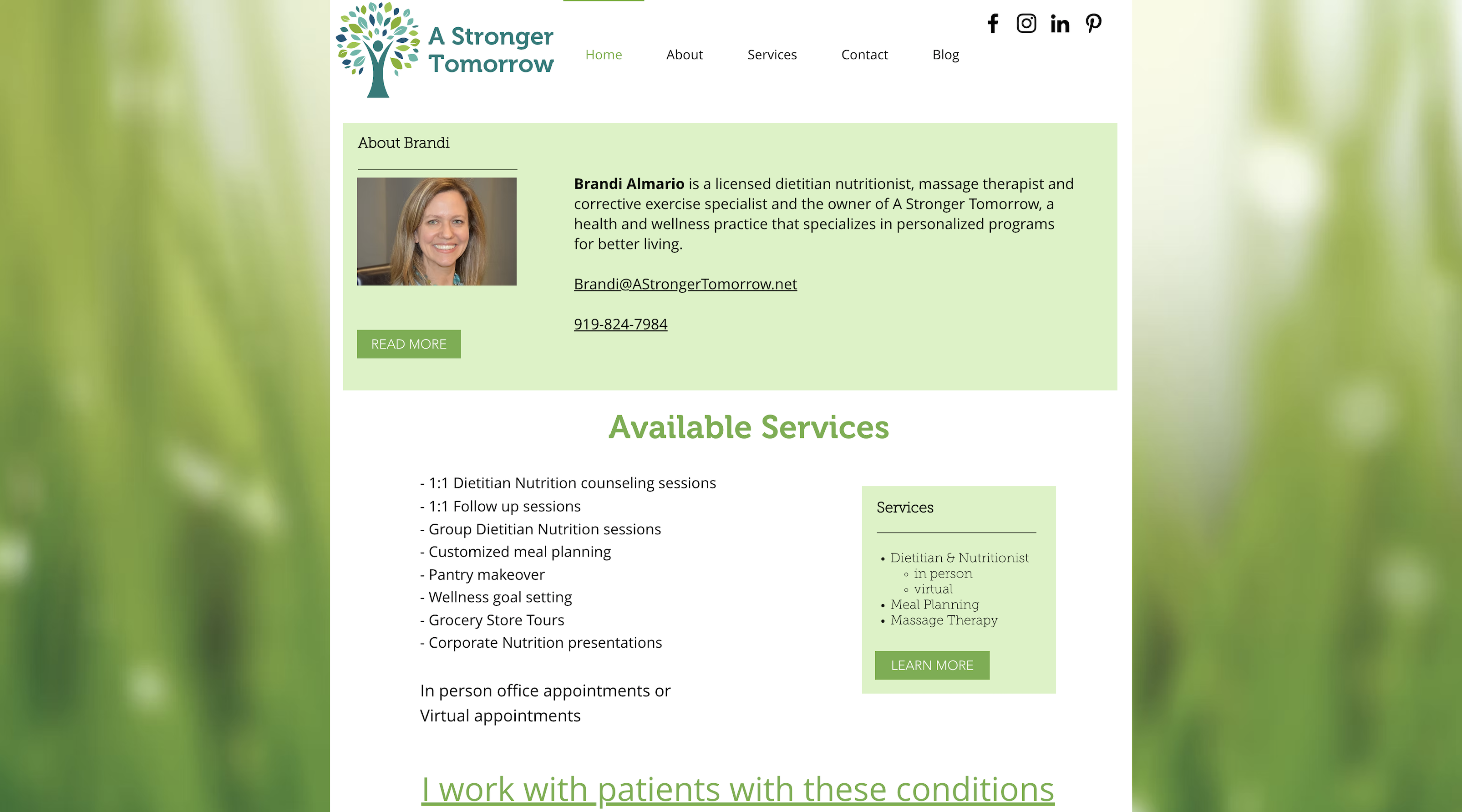
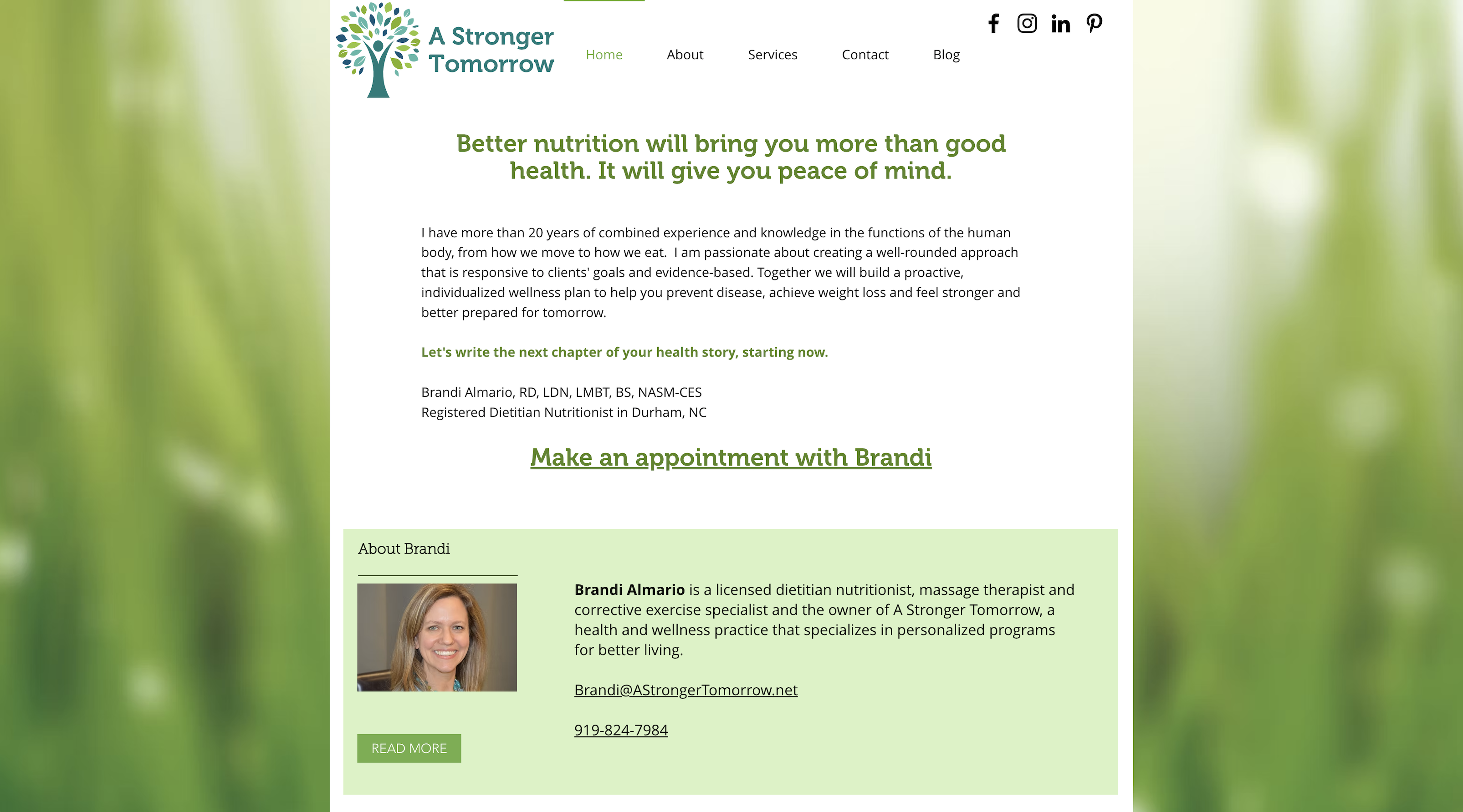
The redesigned site introduces a clearer navigation system, more space for breathing room, updated photos, and reorganized content that makes her qualifications, services, and personality visible to her clients.
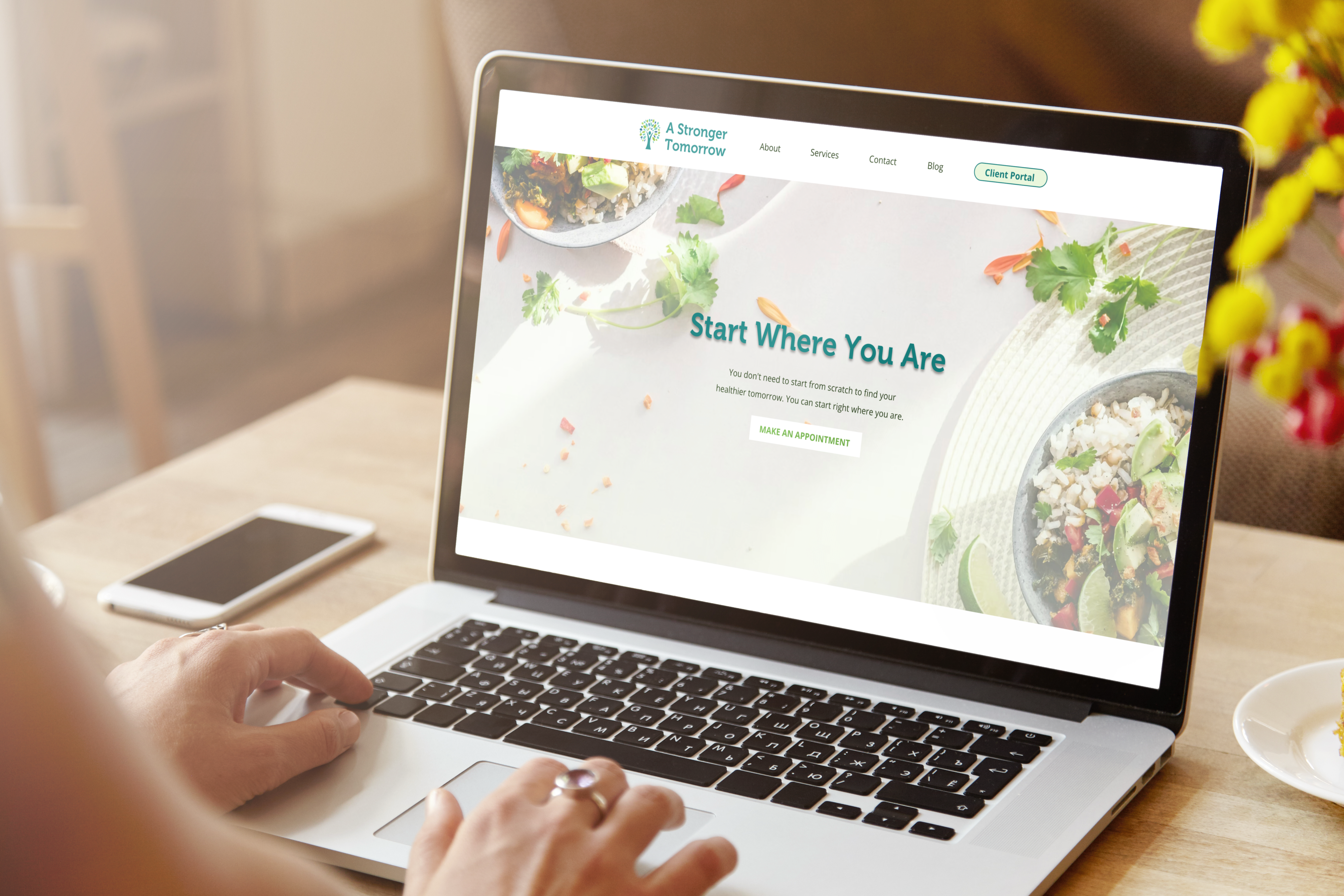
You can view the redesigned website here.
A cluttered user experience made it hard for clients to know where to start.
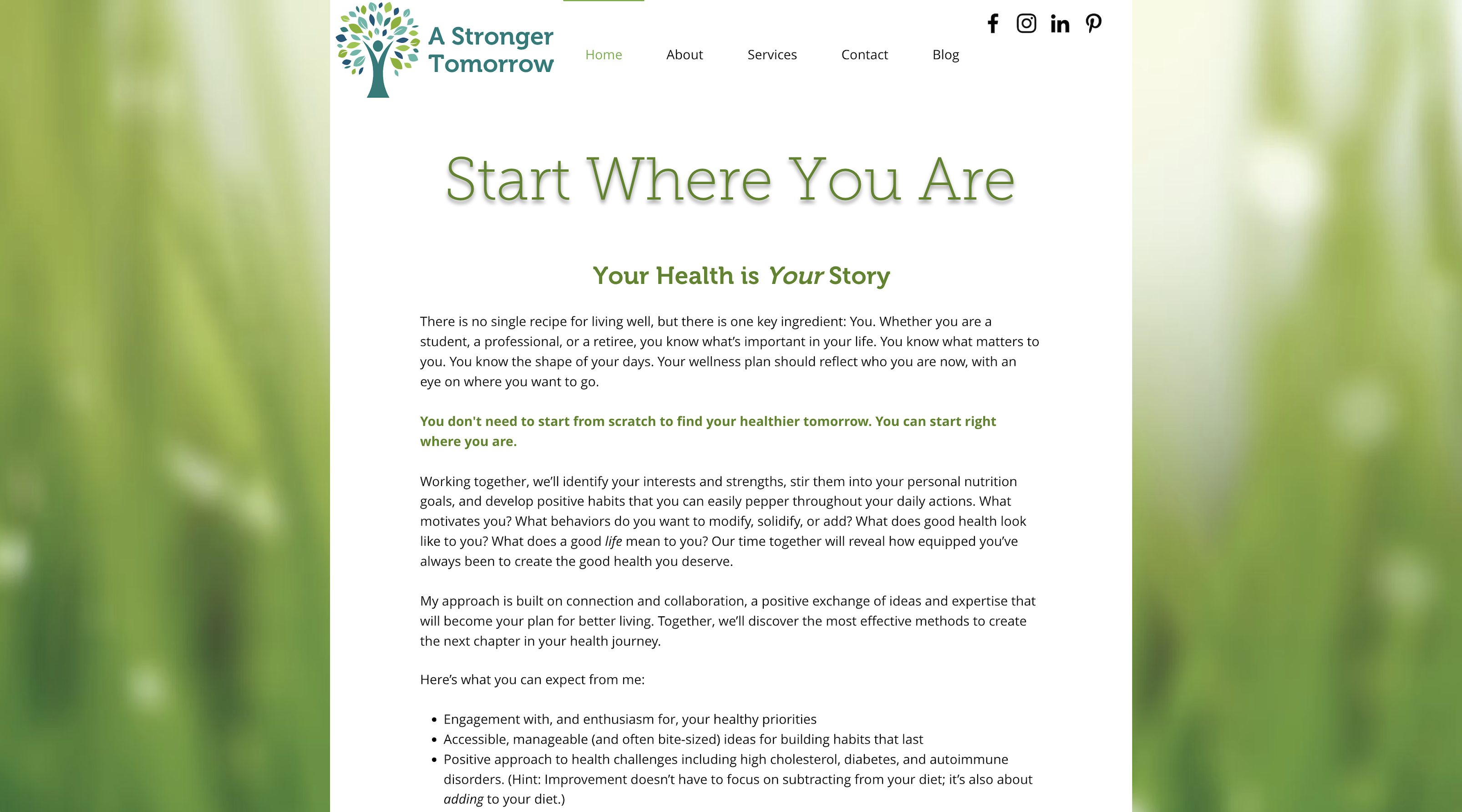
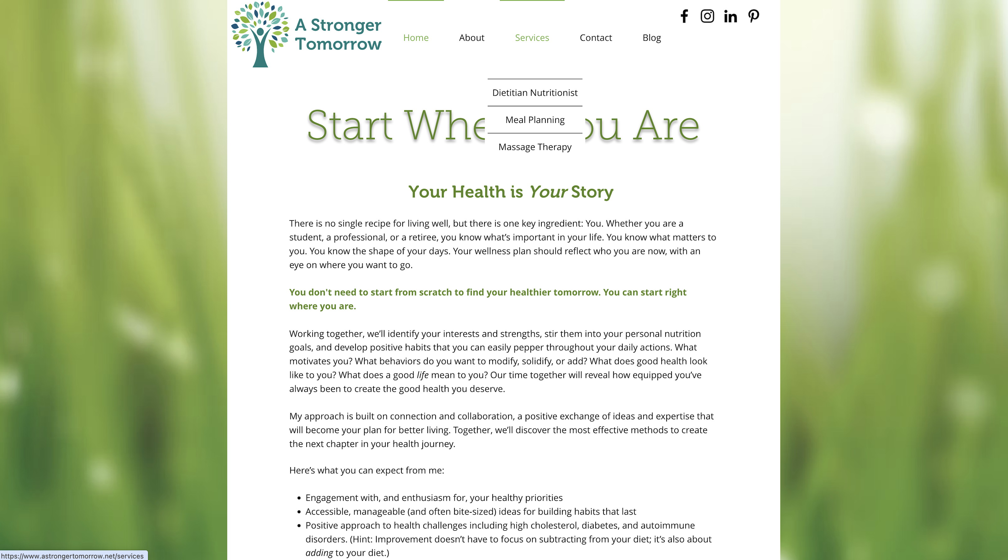
A Stronger Tomorrow’s previous website had valuable content, but it was difficult to navigate.
The original site held lots of helpful information, but the overall experience made it hard for clients to find what they needed—especially on mobile. Page spacing was inconsistent, with tight paragraphs of text that felt overwhelming and difficult to read. Many sections repeated information, and there weren't enough visuals or other elements to break up long text.
The layout also created avoidable friction. The header was irregularly spaced, social icons appeared in distracting places, and side panels compressed the main content, leaving everything feeling visually cramped. The most important action—Book Appointment—appeared only once and was difficult to locate.
In addition, several pages were outdated, unnecessary, or mislabeled, making the navigation feel cluttered and unclear.
When redesigning the site, I focused on addressing these issues while preserving Brandi's original voice and the warm, approachable feel that made her practice unique. The goal was to make the site easier to navigate and more visually organized without losing the personal connection that drew clients to her in the first place.
A sneak peek at the visual elements.
While this wasn't a full branding project, I did introduce a few key visual updates to enhance the site's clarity and consistency. I added a new font that improved readability and introduced a few carefully selected colors that complemented the existing palette.